We use affiliate links in our posts and our site. This means if you make a purchase using these links, we may earn a small commission. You don’t pay a cent more than you would otherwise! Our full disclosure is available under About.
I grew up in the building trade. For fun the family would go look at construction on Saturday afternoons. Of course when there’s a Street of Dreams, I’m right there, checking out to see what the latest trends are, and if something catches my fancy. Last month it was a neighborhood in West Linn, a suburb of Portland, Or.
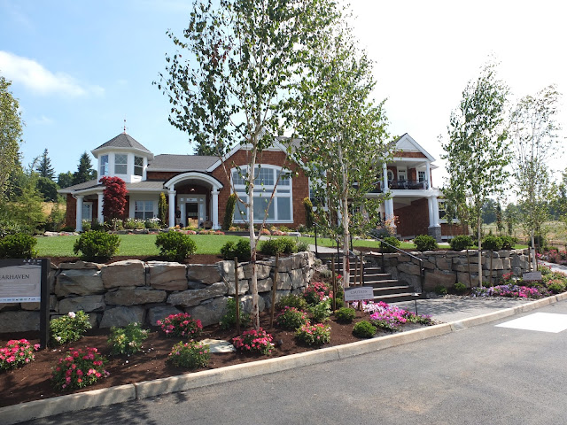
This house is a shingle style house, with lots of architectural features. My photos may not be the best, but its hard to photograph when you have crowds of people going through the house. The house was called “Clearhaven” and is by
Pahlisch Homes, Inc. and listed as the interior designer is Carin L. Atterbury from Surface Home. However then I found that Chancellor Designs staged the house for the show with Tiffany Home Furnishings.. I realized I didn’t get enough pictures, so I found some more on
Tiffany Home Furnishings facebook page showing pictures taken by
Stephen Tamiesie. There was a professional taking pictures the same time as I was—his are better! I wonder if it was Stephen.
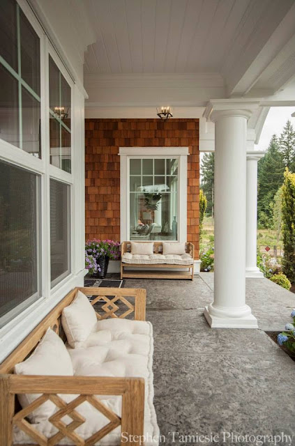
The front has a little bit of everything, style wise. It looks more like a small city than a house. I had to stand in the walkway and stare to take it all in. I liked all the covered porches. It rains ALOT in Portland, so covered porches are nice.
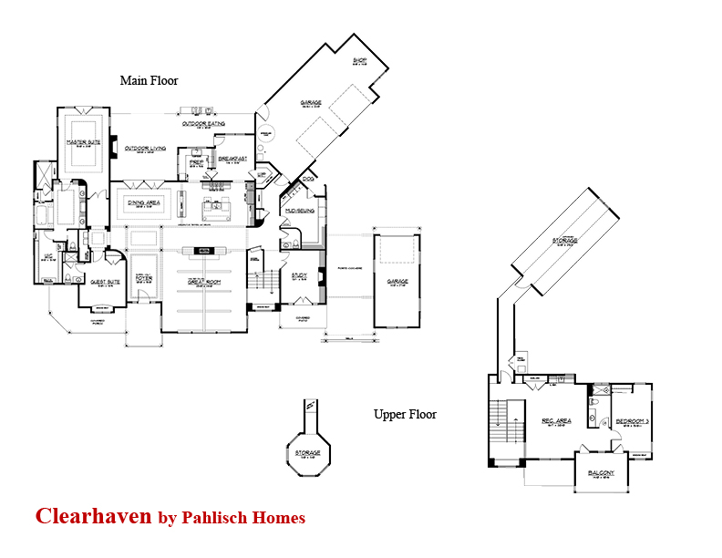
The floor plan is shown here.
THE DINING ROOM
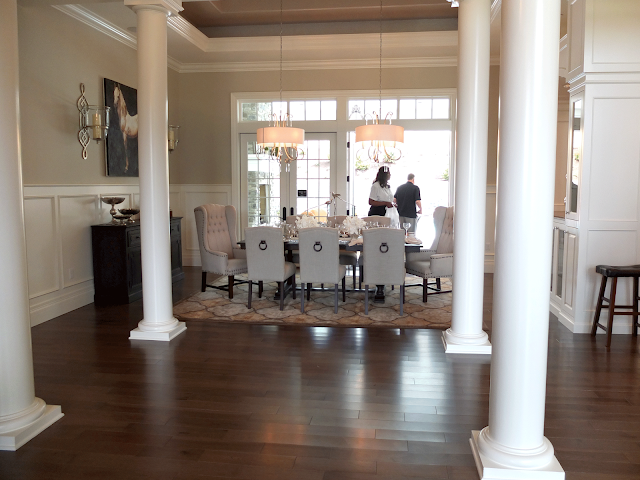
From the entry way, you look directly across into the dining room.
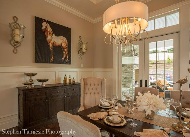
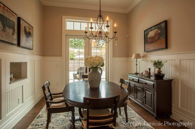
Oh my, the classic lines of the dining room really appeals to me. I love the wingbacks as captains chairs. I did that once. In fact, I still have them, recycled to another purpose. I also like the crystal chandeliers. The room has a lovely old look with the wainscoting. The house is filled with fancy ceilings, like the one in the dining room.
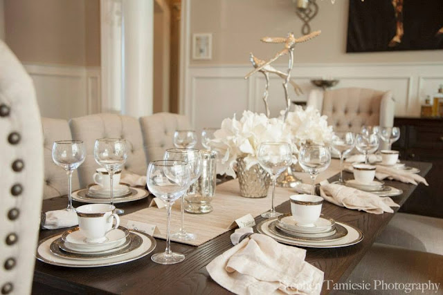
Here you can see a closeup of the sideboard. I like the tufting on the chairs, but then again, I’ve always liked tufting! The tablescape was fun too:
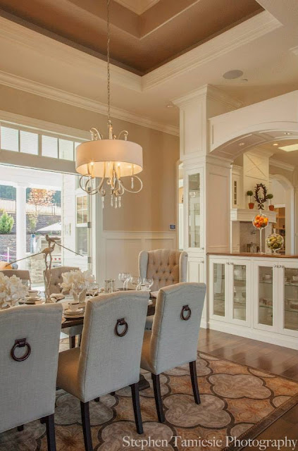
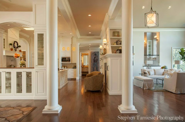
Below, the photograph shows the coffered ceiling, and the pass through cabinets to the kitchen. The little details like the arch make such a difference.
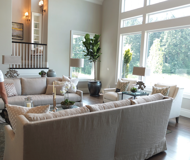
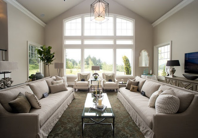
To the right of the entry is the living room:
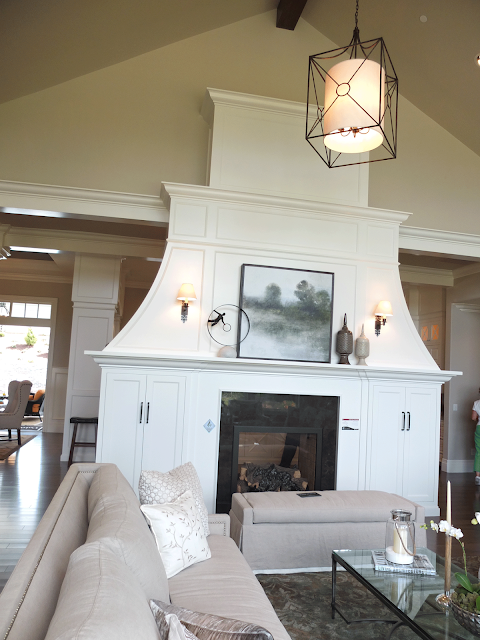
Looking from the entryway towards the windows. To our left is an interesting fireplace:
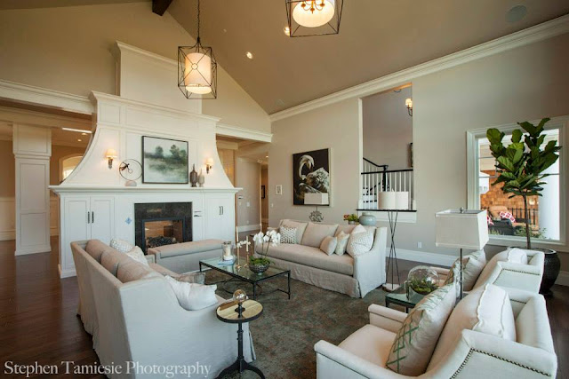
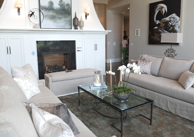
Another view showing the chimney piece:
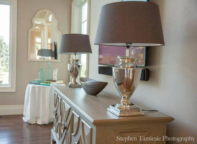
Below is the console underneath the wall mounted TV.
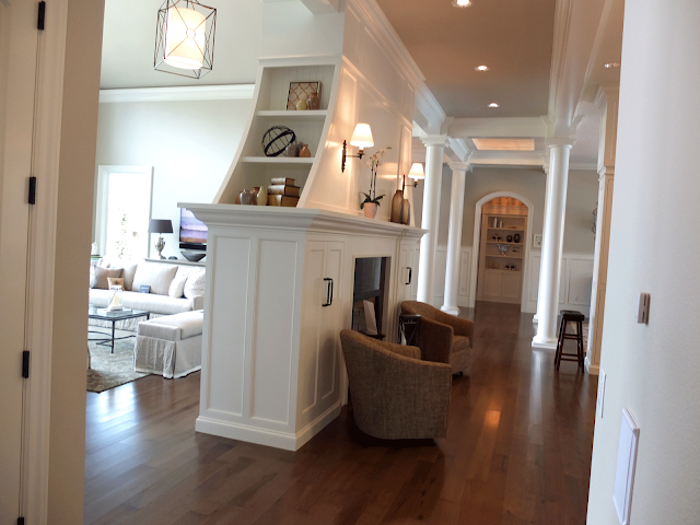
The back of the fireplace:
What do you think of this unusual treatment of a fireplace? I think I like the shape and the sides. It really is a beautiful addition to the house. Notice no TV over the fireplace. You can see it behind the sofa in the living room in the above photo. This side of the fireplace is in the kitchen.
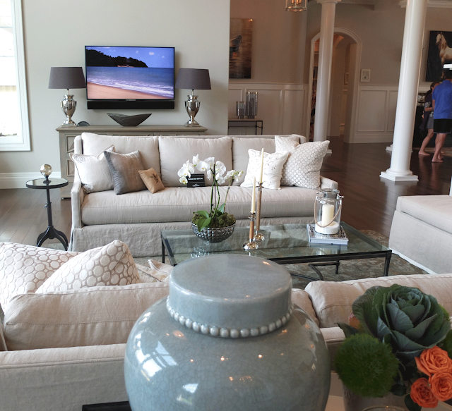
The tv is always a problem. Obviously you can only sit on one side of the room to see it. That works for me, not being over the fireplace. The entryway is behind the tv wall. The sofas, as the dining chairs, are dressed in a simple off-white linen. I think it works nicely, vs. a more formal fabric. It is more welcoming, don’t you think?
THE KITCHEN
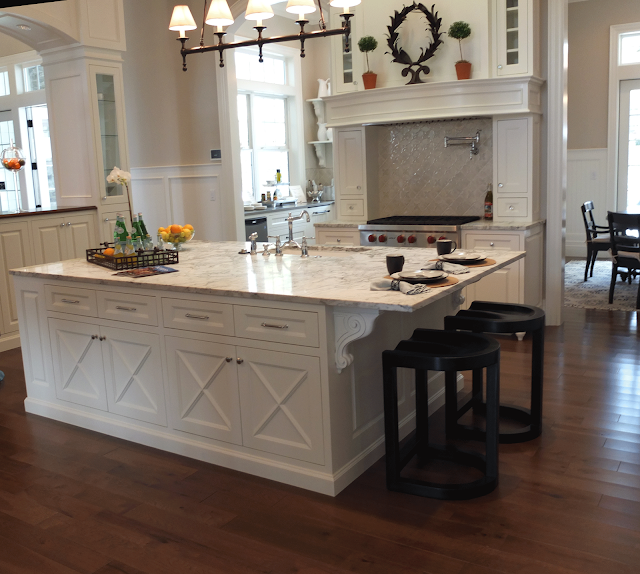
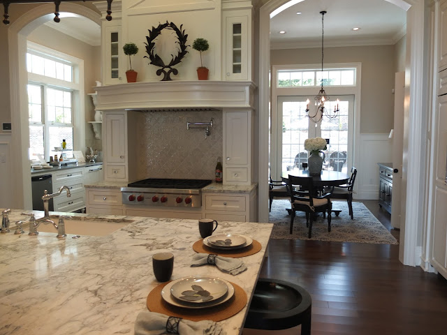
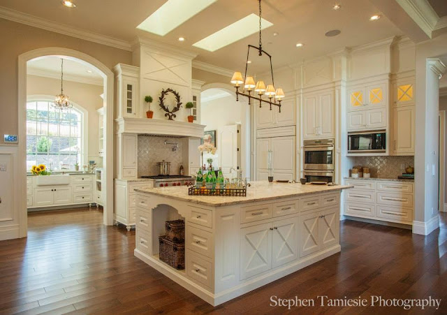
I need a drumroll please! This was my favorite kitchen! I could have just stayed in here. It was very hard to get photos as everyone else wanted to hang out here too! Of course, you can never go wrong with white painted cabinets and marble counters. For trends, I noticed that they did put a pot filler, wow, though, isn’t that a bit high? Of course someone who doesn’t cook probably doesn’t get an opinion!
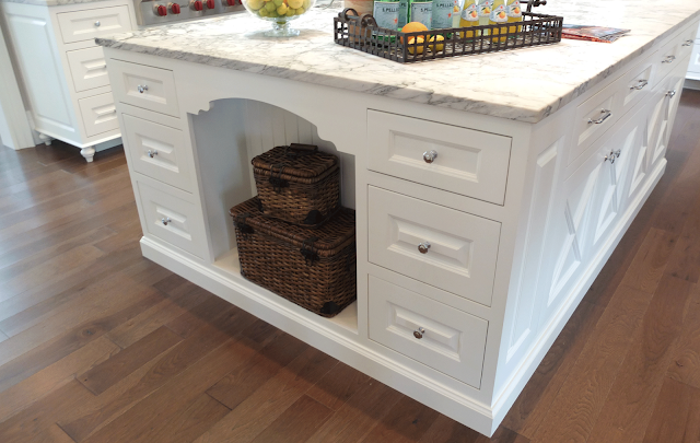
I love the x’s on the island cabinet doors. The other side of the island is too cute too. Love the cabinet cutout.
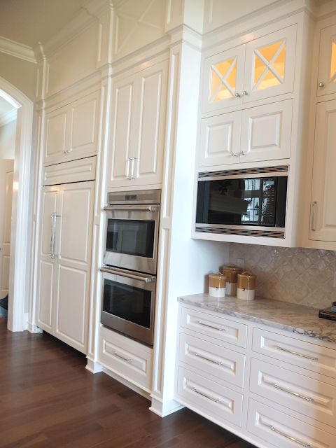
To the right is a wall of cabinets:
On this wall you see the microwave, ovens, and Sub-Zero. Below, you can see to the right of the stove is an alcove breakfast room.
Below the beadboard wainscoting is dressed up with wide boards. I like it!
The breakfast room has a pass through from the second kitchen. More on that below.
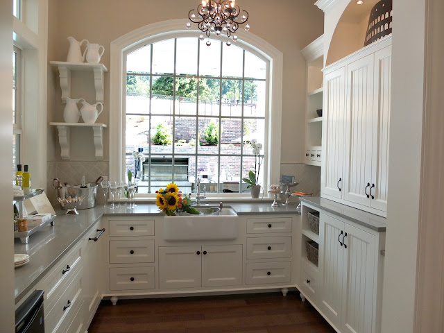
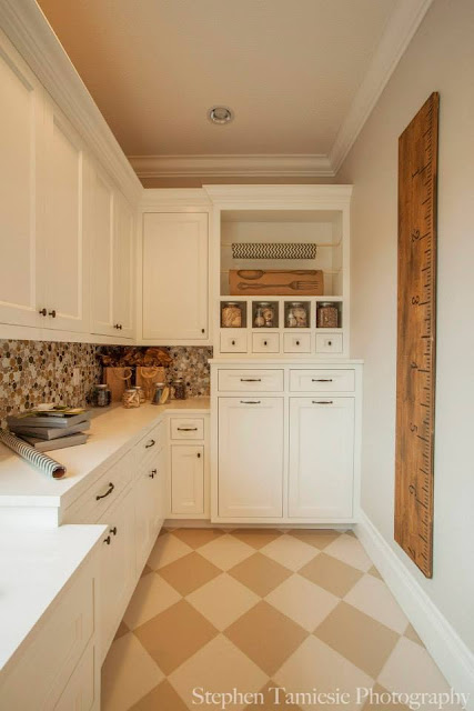
To the left of the stove is a SECOND room to the kitchen. I love this room! It has another dishwasher and farmhouse sink.
Notice the grey stone (marble?) used on the counter. Of course there’s a farmhouse sink. I love the arched cutout above the cabinets.
.
Not sure if I like the feet on the cabinets. I know they are very popular, giving cabinets the feel of furniture. Would they just be dustbunny catchers, or would the maid (me) keep on top of those?! I also like the bracket shelves displaying the white ironstone pitchers.
Notice in the photo above that they added beadboad to the back of these doors. Isn’t that a great look? I love it with the crisp black knobs.
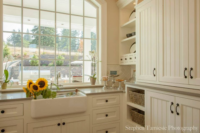
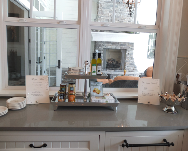
Here you can see the windows that may be able to be used as pass-through for outdoor entertaining. There’s also a window on the right of the sink like this. Love the “counter-scaping”. Especially a card for tonight’s menu. I want that cook! The simple gray counter is a nice complementary change from the kitchen.
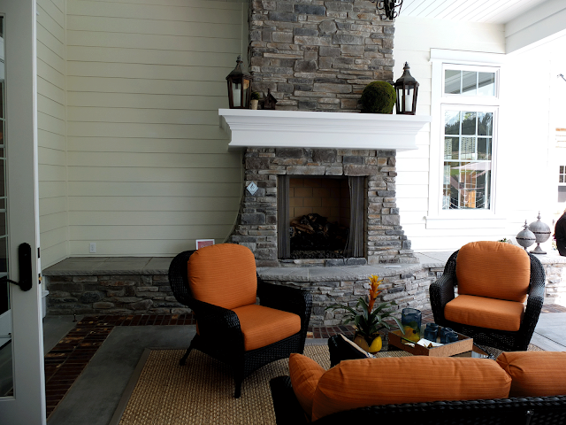
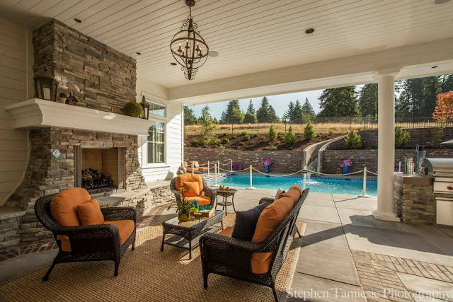
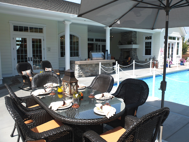
You are looking out onto one of the porches–notice the fireplace echoes the shape of the one in the living room. I like the seating built in–perfect for parties. In the picture above, you get a glimpse of the outdoor chandelier. It looks rusty, which is good in the NW, with 300 days of rain per year.
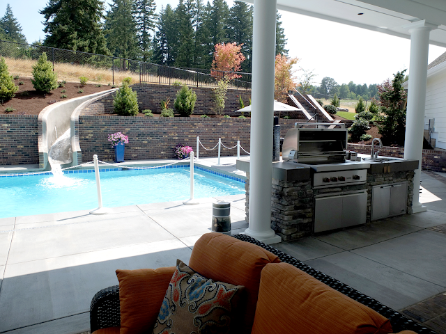
Of course I have to show you the rest of the outdoor kitchen, since we’re doing the kitchen:
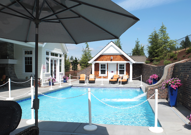
I can only imagine the fun kids would have in this pool. (The slide reminds me of someone who had one in a hillside like this, and every night they would come home from work and there would be water splashed all over from uninvited guests. They installed cameras, and found the dogs, I think they were labs, using the pool. Look for the video on Youtube)
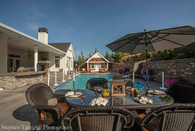
I would like to point out something in composing pictures. The photo below is one I took.
This one below was taken by Stephen. Check out how the different angle looks so much better! He stepped 5 feet to the left of where I was standing. The tablescape helps.
Of course there is a cute little pool house! Below, you can see the back of the house with the outdoor kitchen. In the NW, it has to be covered. The master bedroom is behind the fireplace wall.
THE MASTER BEDROOM
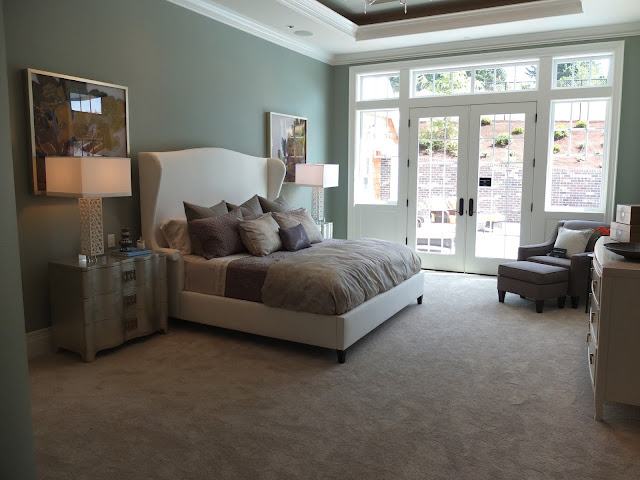
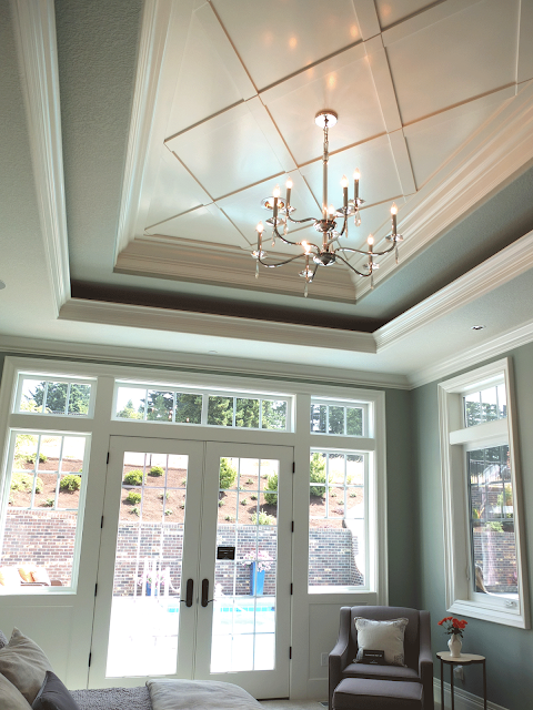
I thought it was interesting that they chose a bold color for the walls. I like it, as it sets off the crisp white trim. Below is a shot of the ceiling. The wood x’s make it less formal to me, which I like.
They didn’t have any window treatments, rats. I’d like to see how they deal with all that light coming into the bedroom.
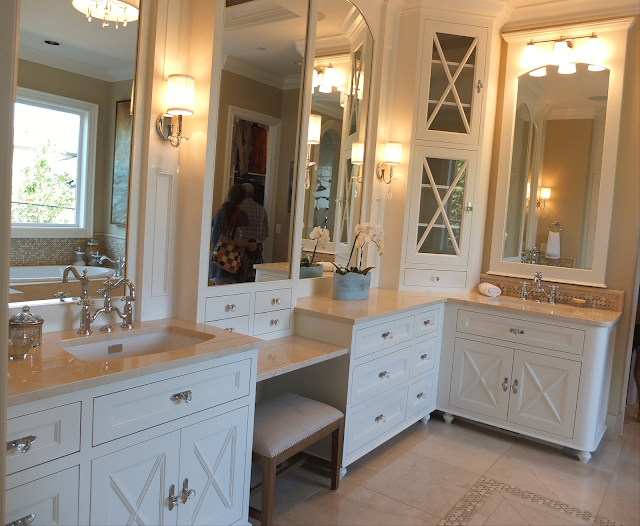
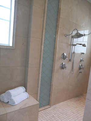
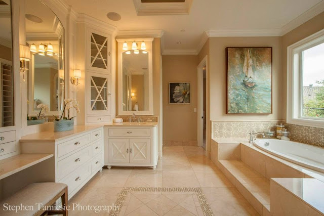
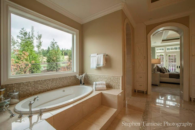
The master bath has the same cabinets as the kitchen. The bank of cabinets above are to the left as you walk in the room. I like all the storage, no open spaces under the counter. To the right is a tub and a shower.
The tiles are a combination of polished marble and aqua glass tiles.
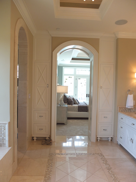
They created a pattern in the middle of the floor, which is nice relief to all that marble. I probably would have stuck with a white marble, but that’s ok. (Who is the nut who put their gross tennis shoes here?)
More photos by Stephen:
Guest Room
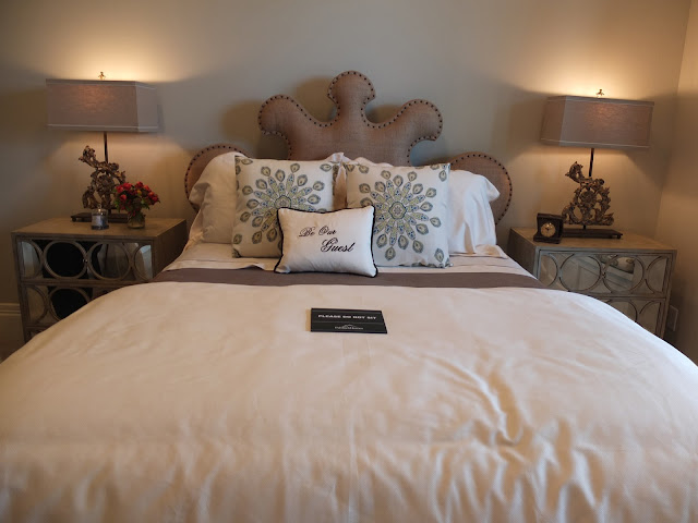
At the master wing is also a guest bedroom. Here is the funky headboard.
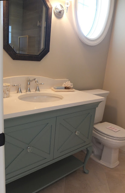
The bathroom has a cabinet like the kitchen, except painted with some pop. I like the oval window in here.
The vanity is cute, but not sure if I am a fan of open vanities– it’s alot of dusting, but they are very popular right now. If you cross the entryway, you can see there’s a long hallway that takes you to the rest of the house.
Powder Room
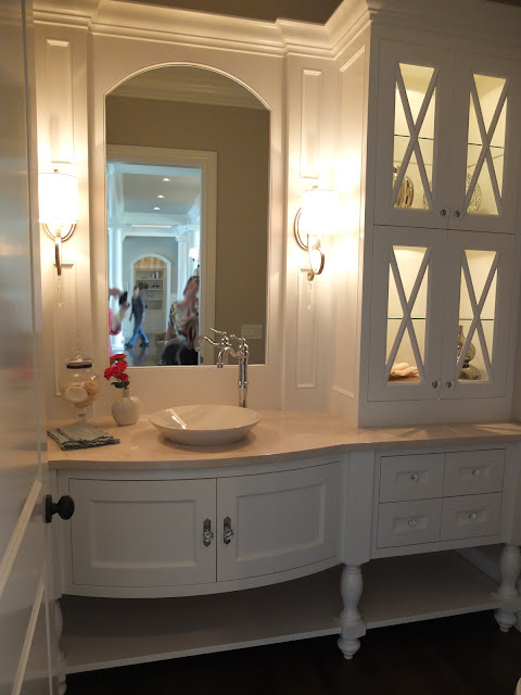
There’s definitely a trend with the open space under the cabinets. I’d probably put towels stacked, rolled or in baskets.
Laundry Room
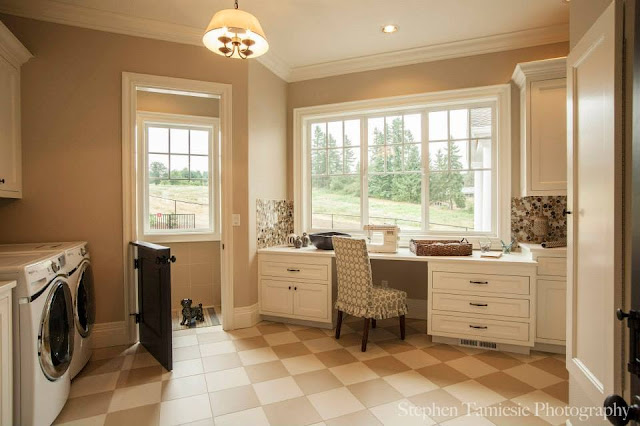
Beyond the kitchen is a very cool laundry room. It has room for a sewing machine which is a big plus in my book. It also allows room for crafting projects.
Don’t you love the dutch door? It’s a perfect spot for that aging dog or puppy when you can’t attend to it’s needs.
The rest of the laundry room has lots of storage and work area to the right of the sewing machine area.
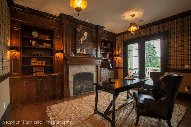
The Study
It looks like a Burberry plaid wallpaper. I’m not a huge fan of the tile around the fireplace, but I do really like the woodwork.
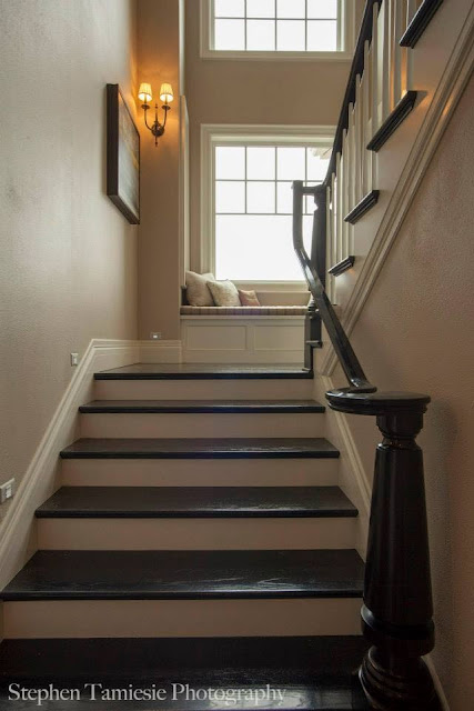
The Staircase
The staircase had black molding and a really nice newel post. There was a landing with a window seat.
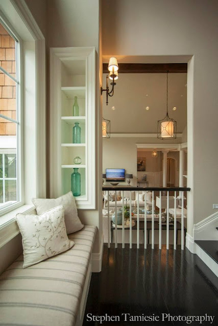
The landing overlooks the living room.
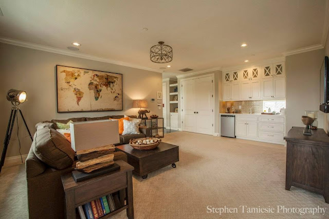
At the top of the stairs was a bonus room, a bedroom and bath.
Even though the entire house was staged just for the show, I really enjoyed walking through and checking out all the furnishings. This house would be a perfect stage for all my antiques!
Missing from the house was the monster theatre room, open family room to the kitchen, exercise room and a multitude of ugly bedrooms. Did you miss them? I didn’t! 4919 SF and only 3 bedrooms. I really enjoyed this home. I especially remember the hand scraped wood floors and the kitchen.
I wonder why we don’t have more shingle style houses in the northwest–with all our rain it seems like shingle style is perfect for us.
