When designing the dining room, I was faced with the question: Which way do you want to have your table facing?
This post may contain affiliate links. See my disclosure policy.
Frankly it was something I hadn’t given any thought. Then I started thinking… when I walk into a room, do I like seeing my table head-on first or seeing the side of the table first? Um, both?? I have to choose though. So I went to the ‘net. What do the designers do?
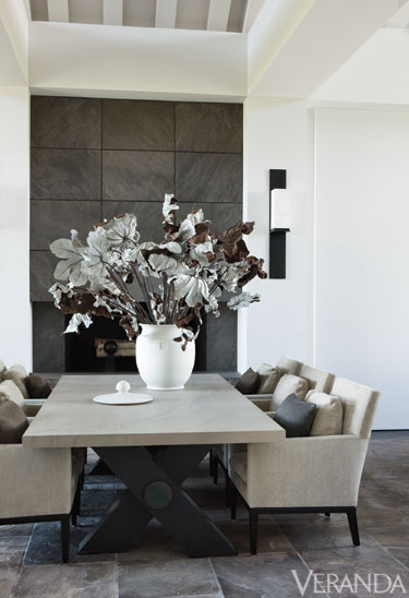
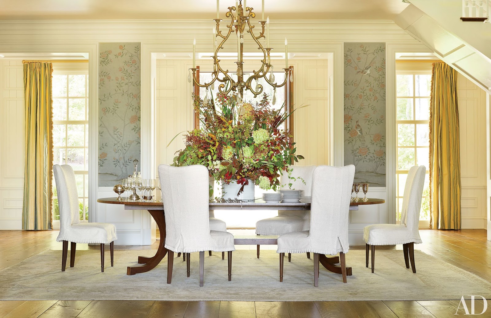
This is what I mean by seeing the table head-on first: You are able to look down both sides of the table. The table is sitting parallel in the room.
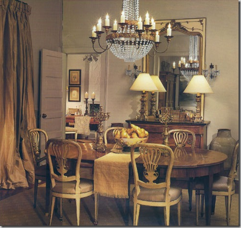
This is what I mean by seeing the side of the table first, below. The table is perpendicular in the room.
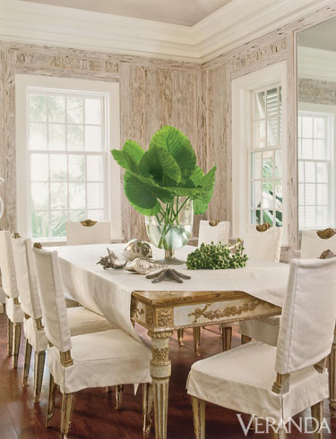
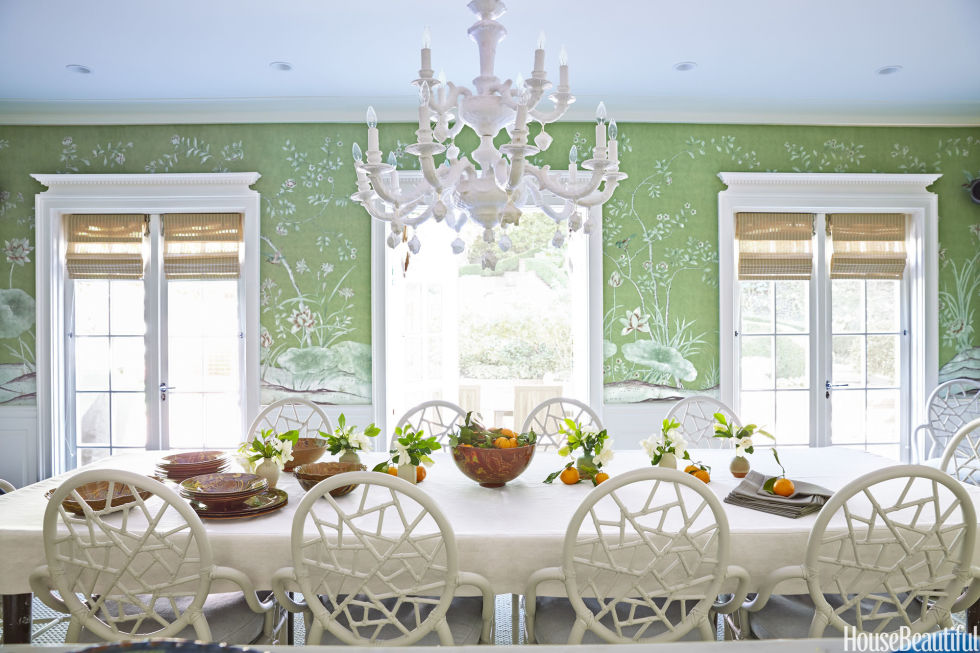
Head of the table first…
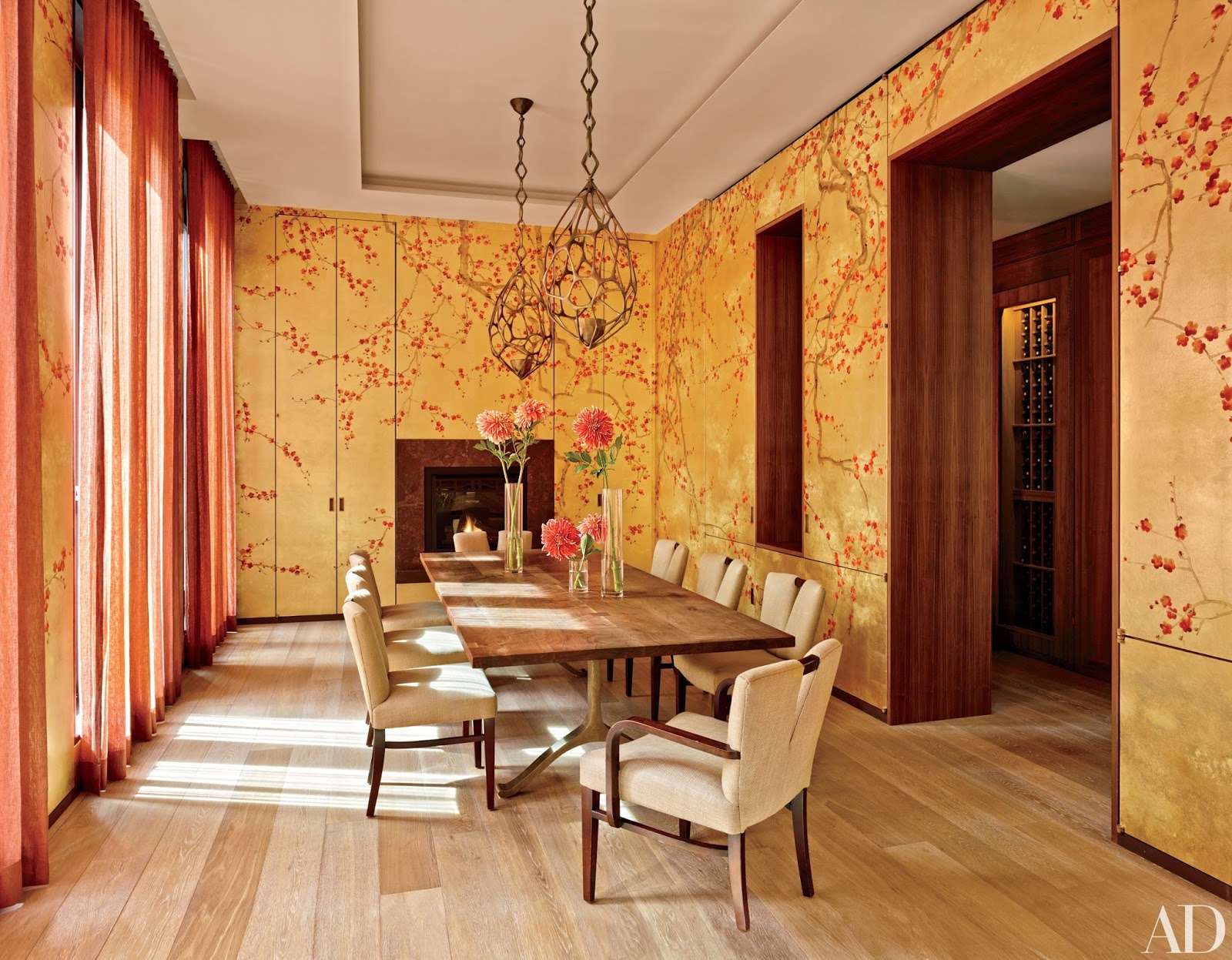
Side of the table first…
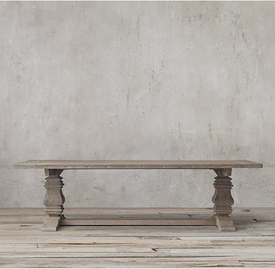
Oh, if you are wondering what table I have, it’s this one below from Restoration Hardware. It is 10 ft long by about 5 ft wide.
Okay, back to looking at other pics… Head of the table first…
Side of the table…
I’ll just stop talking now and let you just look at the pictures. Think about what you think looks best. I’ll recap my thoughts at the bottom.
 |
| from Bunny Williams |
This dining room is really beautiful, love the gray-green wood paneling and plates. Oops, got distracted. I’m SUPPOSED to be looking at which way to place the table.
 |
| source |
 |
| from Mary McDonald |
 |
| from Mary McDonald |
 |
| from Tara Shaw |
 |
| from Mary McDonald |
 |
| from Martin Lawrence Bullard |
 |
| source |
 |
| from Tara Shaw |
Viewing the dining table head-on when walking into a room has some pros – it’s easier for guests to walk down each side of the table and it’s easier to serve guests as well. You don’t have to walk all the way around the table to sit or serve.
Having the dining table view from the side makes quite a pretty sight – you can see the pretty table settings that I like to set.
When I was looking for inspiration for this article I noticed a trend… there was about 70-80% of the tables were photographed head-on. Then the remaining 20-30% were shot the other way. Thus, it seems that the preferred way to have the table arranged in the room is to have it sitting parallel, or head-on, when you walk into the room. So, that’s the way I’m leaning to have it.
What do you all think? Is this something you’ve ever given any thought to? Or do you have a round table so it’s a non-issue?
Sources – the House Beautiful Pictures were from This Article.
Architectural Digest pictures are from here
Veranda Pictures are from here
Follow Peonies & Orange Blossoms’s board Inspiration-Dining Room on Pinterest.
linking up at: amaze me monday The Scoop! Metamorphosis Monday’s Inspire Me Tuesday Wow us Wednesdays! Moonlight and Mason Jars Share Your Style Thursday Favorite Things, Thoughts of Home Home Sweet Home Feathered Nest Fridays Foodie Friday & Everything Else Best of the Weekend Share it One More Time
Written at http://peoniesandorangeblossoms.blogspot.com




















Beautiful inspiration pics!!!!! I have never had the luxury of deciding which way my table is placed in the room as my room only accommodates a table one way. Now I have a round table so it is perfect right? LOL
Love your RH table….very pretty!
~Des
Well, it isn't something I had given any thought to until I was asked about it! Thanks, I love my table too!! I'm on the hunt for new chairs because I only have 6 matching chairs and they don't make them anymore!
Amazing all the small details that one needs to consider when building a home. This is one I would not have thought about, but I tend to lean toward the head on approach. We have an oval table and it is head on as you view the dining room from the living room and from the sun porch. Love your choice of tables. If we had the room, I would have a long dining room table like your choice. Beautiful! Eager to see all the fantastic table you set.
Yes, how to place my table never occurred to me until I was asked! Funny the things you don't even think of when building a house! I can see how one can get decision fatigue. I'm leaning towards the head-on approach too!
What a great question! I have never built a house so haven't got to make that choice–not sure I would have thought of it! I vote for head on. When I have family and friends gather, I always want pictures. When the table is set head it is easier to get almost everyone in the picture without having the "backs" of people on one whole side of the table (my dining room is narrow and small.) Aesthetically, side on is a beautiful choice, but for me form has to follow function.
It wasn't something I had thought of until I was asked… I thought, oh, I guess that is something to think about! I appreciate your input, totally agree, form to follow function!
This is very informative Angelina. I never thought about it but such a great tip. The photos are just incredible. So many gorgeous rooms and incredible design.
Love them all but I do have to agree, it is about function at the end.
Have a wonderful week.
Janet
Thank you, a pretty room won't work if you can't walk around in it
Don't think my comment posted as 1010ParkPlace registered… Your first photo is one of my favorite designers, Tara Shaw. Love her style, but can't afford anything she does. LOL!
I love Tara Shaw too, but yes, she is really pricey!
AAACCCCKKKKKK! Too many inspirations….!
No matter what you are limited by your room–doorways–and furniture. Start with that….take pictures of the 'bones' of it…and then print several pages of this in lightest black and white—and color it in—with your favorites. You can always copy and paste inspirations in…to your bones!
All your inspirations are gorgeous though…lol…totally understand your confusion. Sandi
Oh, no, in these inspiration photos I wasn't look at the room style at all. I was only looking to see if I liked the table head on or side view first, that is all! Agreed, too many inspiration photos can be confusing. I think I've made up my mind by looking at these, I will set the table head on in the room!
You found amazing inspiration photos. Our dining table only fits one way in the room and luckily that flows with the walking path. Someday I'd like a round table.
Thanks for sharing with us at Thoughts of Home on Thursday. 🙂
Oh, well that makes it easy for you since it works!
I live in a small 1208 sq ft condo and my dining table is in the living room. The table is placed against the wall to optimize space! I should get a small round table but according to Fengshui, your dining table should always be big and sturdy to ensure food on the table always.
When I lived in a small condo I had my table against the wall too!
First, I totally have dining room table envy! I'm holding out for a restoration hardware table – I won't settle for anything less. Thankfully if I have my husband in the right kind of mood, we can find one for a good deal since there is RH outlet store near us. Sorry – now I digress! I like the head on look – it could be partly because my favorite styled rooms where done that way.
We actually found our table for a good deal at the RH outlet. Couldn't believe it was there when I saw it, bought it immediately! I am going to go with the head-on look I think!
Drooling over all the inspiration!!! The Restoration Hardware table is my favorite! Loving your blog! If you are at all interested in joining in on one more link party I would be happy to host your talents! Making Broken Beautiful runs every Thursday thru Sunday and is a furniture and home decor party over at The Curator's Collection. You do lovely work and I'd be honored to host you! I hope you have a great weekend!
Smiles!
Terry
http://thecuratorscollection.wordpress.com
Making Broken Beautiful
I love our table a lot! Thanks for the invite, I'll have to check it out!
Fabulous photos! Head on would be my choice. It seems less cluttered somehow.
No matter how you place the table, I hope you will pay attention to the windows, so that in daylight no diners are bothered by outdoor light blinding them. I have a pair of windows in my dining room and had to hang curtains to keep the people facing the window from being distressed by the glare in their eyes. I love uncluttered windows and lots of natural light, yet am not willing to give up lunches with the girlfriends for my preference for lots of light.
I really love cottages, but your photos are the stuff of princess dreams. Sigh…..
I am going with head on. There will be one window that could have a sunlight issue however no fear, the shutters can close and the problem is solved. The photos were not meant to represent a cottage, I was just simply looking at the arrangement of a table in a room.