I have recently been inspired by the color palette of coral and persimmon.
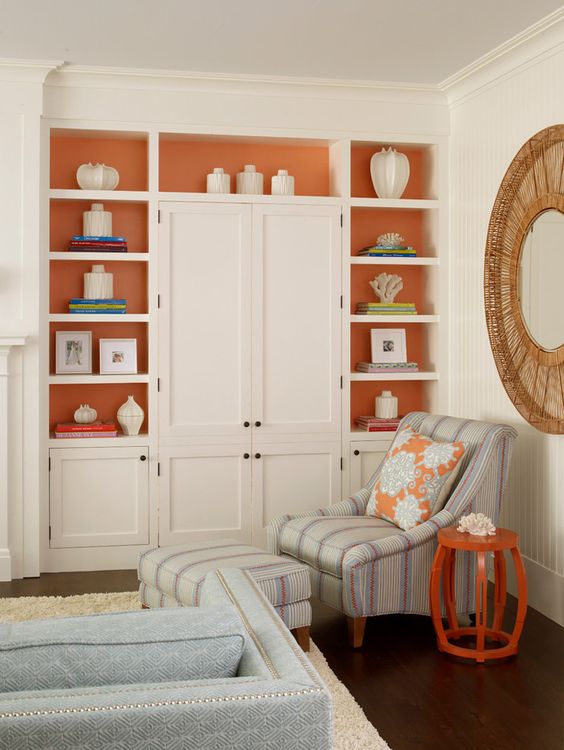
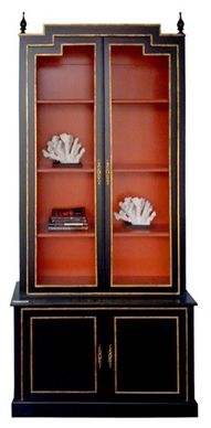
I have been debating about painting the cabinets in the office kind of like so, in the picture below… with coral/persimmon interiors and either a shade of blue/grey or even black exterior!
This post may contain affiliate links meaning I make a few cents when you click.
Doesn’t it look pretty?
I love the way it makes a cabinet pop!
It is a little unexpected and kind of fun!
When I told my husband this, he asks me, “Are you okay? Are you ill?” because he knows how much I *hate* orange.
Yes, I’m fine I replied! I said the reason why it is interesting because most of the house decor is shades of blue, and this is the opposite side of the color spectrum, so adding hints of it here and there makes the blues look even better!
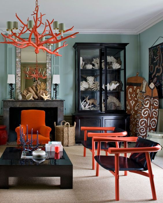
It can be used in modern rooms, like below…
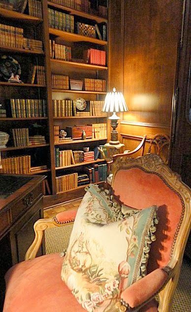
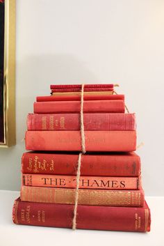
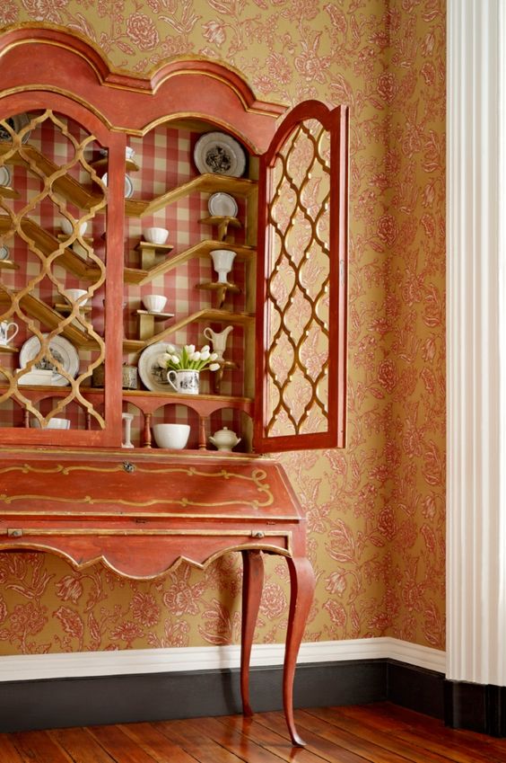
Or in traditional rooms, like on the books and the chair below!
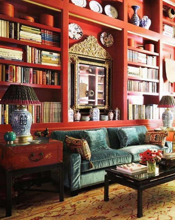
We could go bold and paint the entire bookcase like so, below:
Or more subtle with the accessories in the room adding the color…
Here are the various shades of coral and persimmon from Pantone.
I still like it best inside a cabinet though…
But I find myself even liking this color of accessories!
I don’t own *single* piece of orange-shade *anything* in my closet.
You see this color group usually looks terrible on me! But, a bracelet can’t look bad on me, right?
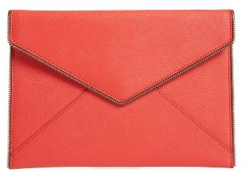
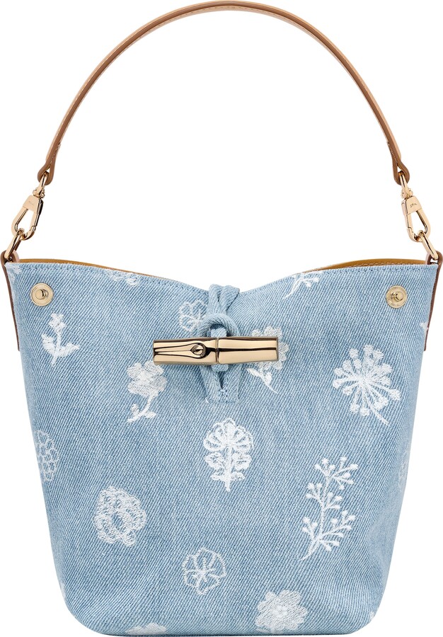
Or a tote..
Gemini Tote – perfect for the beach
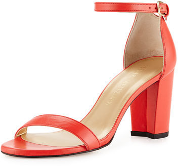
Or some shoes… Coral Shoe
drool worthy…
Goyard…
Hermes blanket…
Actually, that reminds me… some of my favorite nail polish I wear on my toes is coral!
So I DO have one thing that I wear in that color group!





















This new coral tone is a pretty accent. I really like the version that is a bit more muted and on the pink side. I think it is called "pink grapefruit" and I'm seeing it now in fashion and interiors. Have fun painting your office!
Lisa
I like that version a lot too!!
Beautiful post!! Love these colors! Thanks so much for stopping by!!
Hugs,
Debbie
Thank you!
What a beautiful contrast for an accent color! Very nice. 🙂
Isn't it lovely?
Great roundup! This is such a great color for spring!