In this post – what color to paint a Provence French style house??
The time to paint the exterior of our house is around the corner…. and I am trying to pick out what color to choose!!
I’ve created this post as an inspiration and perhaps some of you readers may have some suggestions for me!!
Now, remember, my house is a Provence inspired house – think French Mediterranean not Haussmann Paris!
Provence has bright colors. My friends who were just recently there said all of the new houses are painted in a deeper yellow – the older ones are a faded yellow.
I have tried color matching pictures via easyrgb. It always picks up the shutter color and not the building color. Grrr!
I do really like the colors below.
 |
| source Cote de Texas |
I do fear that it may turn too peachy orange. I don’t really want a peachy house. Or do I? Look how pretty this one is below.
Now a lot of the French houses just have their stone painted over – making the color a little different then painting onto stucco!
| via Sharon Santoni |
Other houses are all stone without any paint. I tried not to include those in my pictures!
| via Provence Poiriers |
The houses also leans towards pink!
It seems to be either – yellow houses with blue shutters or pink houses with green shutters! Stone houses have white shutters or lighter blue-gray shutters.
Husband says NO pink house. Okay fine, but I’ll still include pictures!
Monet’s house in Giverny.
 |
| via French Larkspur |
Penelope Bianchi’s house, love all of those gorgeous vines!
 |
| Penelope Bianchi’s beautiful house via House Beautiful |
Love this house too, but I have to remind myself, no pink no pink.
 |
| Frederic Fekkai’s home via Architectural Digest |
Below is a new build with more cream and grey-blue shutters. However, this house could actually be yellow but with the bright sun it fades out!
 |
| via Finton Construction |
I really like the color of Sharon Santoni’s house although can’t figure out the color!
 |
| Sharon Santoni’s pretty house – |
Then there’s Vicki Archer’s gorgeous house too!
 |
| Vicki Archer’s Mas de Berard |
I found these two color boards from the French Provincial Furniture blog.
They matched colors of Provence to Farrow and Ball colors.
They just seem so bright to me! I am a little nervous painting the house so bright.
Sherwin Williams created this historic color palette for the restoration of the French Quarter in New Orleans. I cannot find a larger picture of this anywhere but I think these would be the correct colors, right?
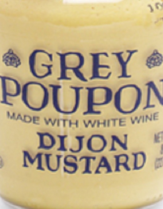
I read somewhere that the proper French yellow is that of mustard – Grey Poupon mustard color, not French’s!
Below are two color samples on our house.
I am told the yellow WILL fade in the sun – so picking a brighter color now is okay because it will fade somewhat. Below they are in the shade – in full sunlight they do wash out some.
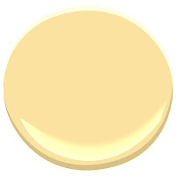
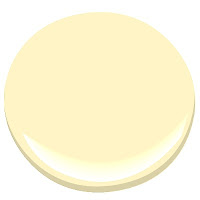
Top color is BM Hawthorne Yellow HC-4. Bottom color is BM Fresh Butter 290. We preferred the top color to the bottom color – the bottom color, Fresh butter seemed too… buttery!
Also considering (all colors are Benjamin Moore) Weston Flax HC-5 and Windham Cream HC-6 , Provence Creme 2021-60, golden honey 297, somerset peach 163moonlight 2020-60, fresh butter 290.
 |
| provence cream 2021-60 |
 |
| hc-6 windham cream |
 |
| golden honey 297 |
 |
| weston flax hc-5 |
 |
| fresh butter 290 |
 |
| Somerset Peach 163 |
 |
| Valley View 214. |
 |
| moonlight 2020-60 |
Now, looking at shutter colors too…
 |
| Palladian Blue by BM |
 |
| Parma Gray by FB |
 |
| soft chinchilla by BM |
What’s odd about these blues on the screen is that they look a lot different in person.


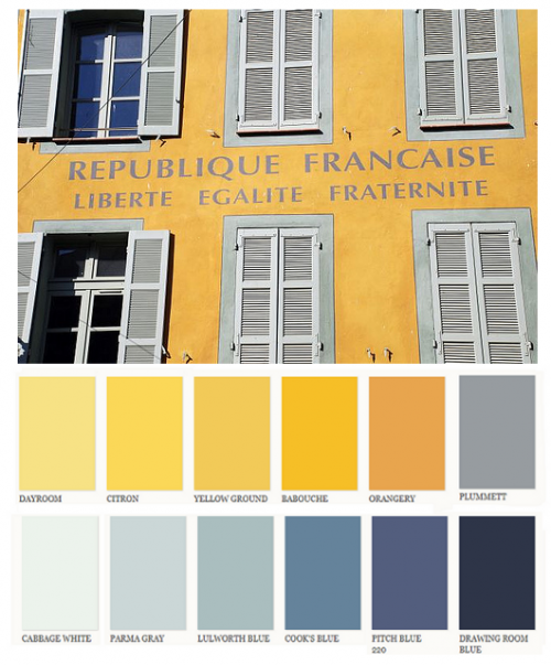













What about painting the house a lighter version of the parma gray and the shutters that lulworth blue? In my case, I might get tired of the yellow unless it was very light.
Hmmm interesting idea! I'll think about it!
I love Monet's house, but that's REALLY making a statement!
Yes it sure is! I wouldn't do that, but I had to include a picture as it is so pretty!
My sister lives in a yellow house and I love it. It's in the country with stone on the front. I never tire of a happy yellow.
A happy yellow, yes, maybe that is the shade I am looking for!
These houses are gorgeous, yummy, and scrumptious! I love the colors of Provence. I've been to Monet's house at Giverny, but I've not toured Provence. At my own home, I have yellow shutters on a sage green house, and I really like them. I live in the coastal South where happy colors fit in with the sunny, warm climate.
Carol ("Mimi") from Home with Mimi
That sounds pretty!!
I think I have a stash of photos much like yours! When we built our house 15 years ago, we painted our house similarly to photo #3. It was a lemon yellow stucco with a light blue/turquoise shutters. We live north of Atlanta, and over the years the sun differentially affected the color on the four sides. The front became almost splotchy. About 4 years ago we gave up and painted the stucco a creamier color and darkened the tint of the shutters, more like #13 (via Finton Construction) So far we are much happier with the way the colors are holding up. We used Sherwin Williams paint the second time.
Oh that's great. Yes, the sun is something I worry about, but I do know that the brand of paint can really affect the color fading over time. Super cheat paint brands fade more so than others, I do know that! We are leaning towards somerset peach, mainly because the more yellow colors are making the rock look bad! I love #3 and #13! Both are great!