 We use affiliate links in our posts and our site. This means if you make a purchase using these links, we may earn a small commission. You don’t pay a cent more than you would otherwise! Our full disclosure is available under About.
It’s finally here! I am sharing my farmhouse kitchen reveal with you all today! I wrote about designing our dream kitchen here and now I’m so excited to walk you through the details of my kitchen.
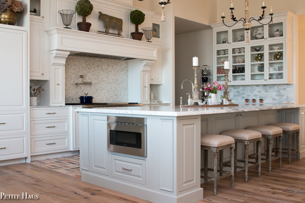
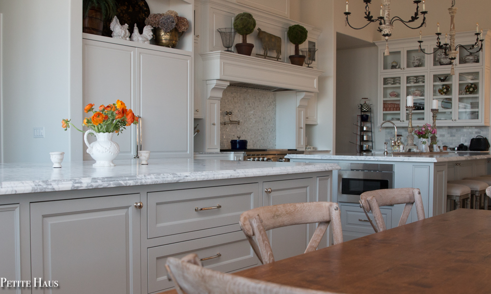
Our kitchen has several areas – the “main” kitchen and the “baking” kitchen. Below is the main kitchen. The island below is countertop height and we love sitting here for dinner. Many islands require taller bar stools – I like having them at countertop height. The microwave is in the island. The microwave drawer slides out (as opposed to the door swinging open). It took some getting used to but I love it now. Plus, it kind of hides the microwave (face it – microwaves aren’t pretty!)
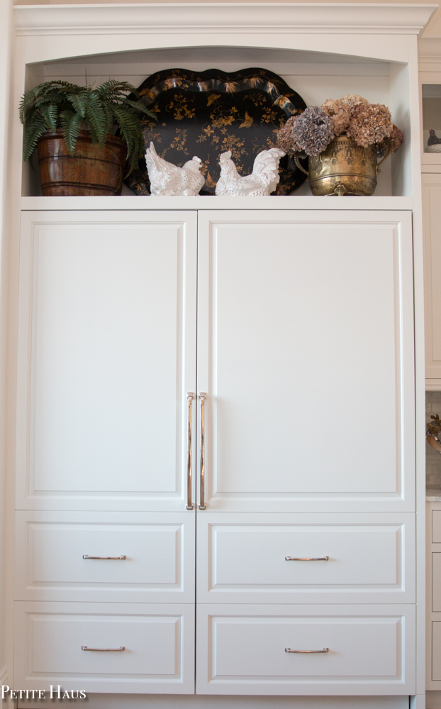
Below is our freezer and refrigerator. We had custom wood panels made to mimic the rest of the kitchen. We had the two door panels made to look as if it were 4 drawers and 2 doors.
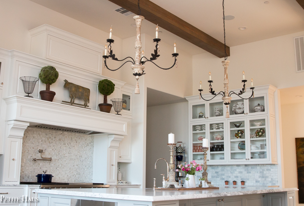
The 14 foot ceilings are accentuated by these beautiful beams. The beams were custom stained by my mom! She did an incredible job. We kept telling various contractors what we wanted with the stain and no one could understand – so finally just did it ourselves.
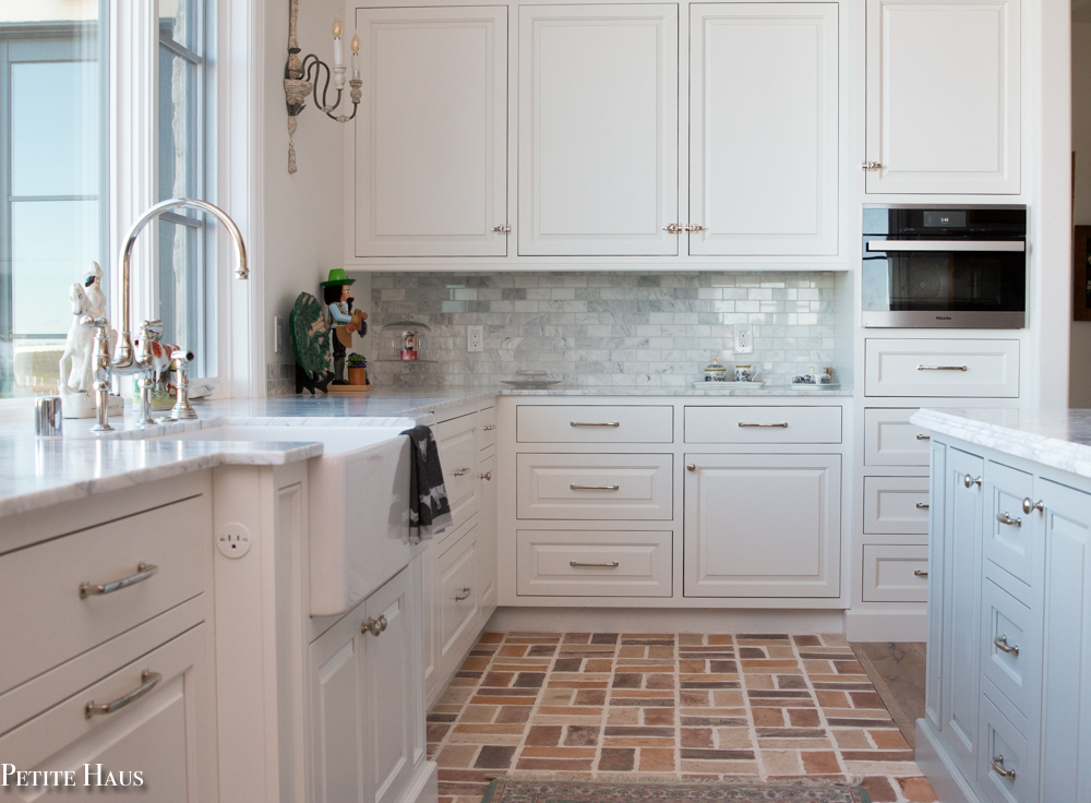
We decided to put brick in between the range and the sink – the area we have called “the splash zone”. I wish we had put brick through the whole kitchen in retrospect – it is more forgiving with spilled food! 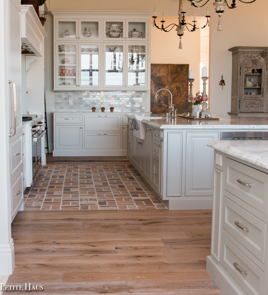
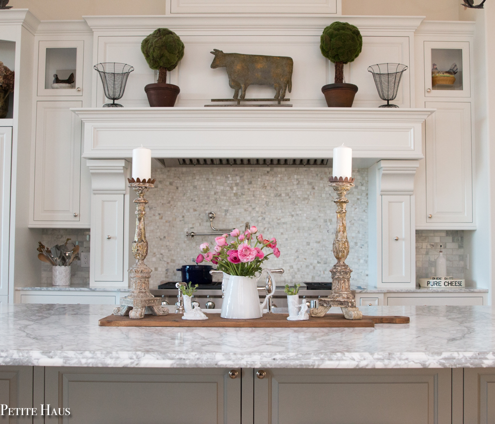
I was looking for a pretty French blue/gray color for the islands and eventually settled on Benjamin Moore Silver Song. I love how it looks with the Carrara marble.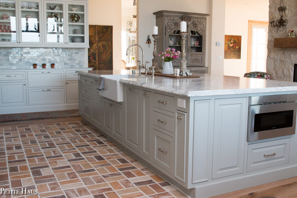
The island has a ton of storage – below you can see that there are doors below the island on the seating side. I have seen so many kitchens where they just put panels here and I think about all of that wasted storage space!
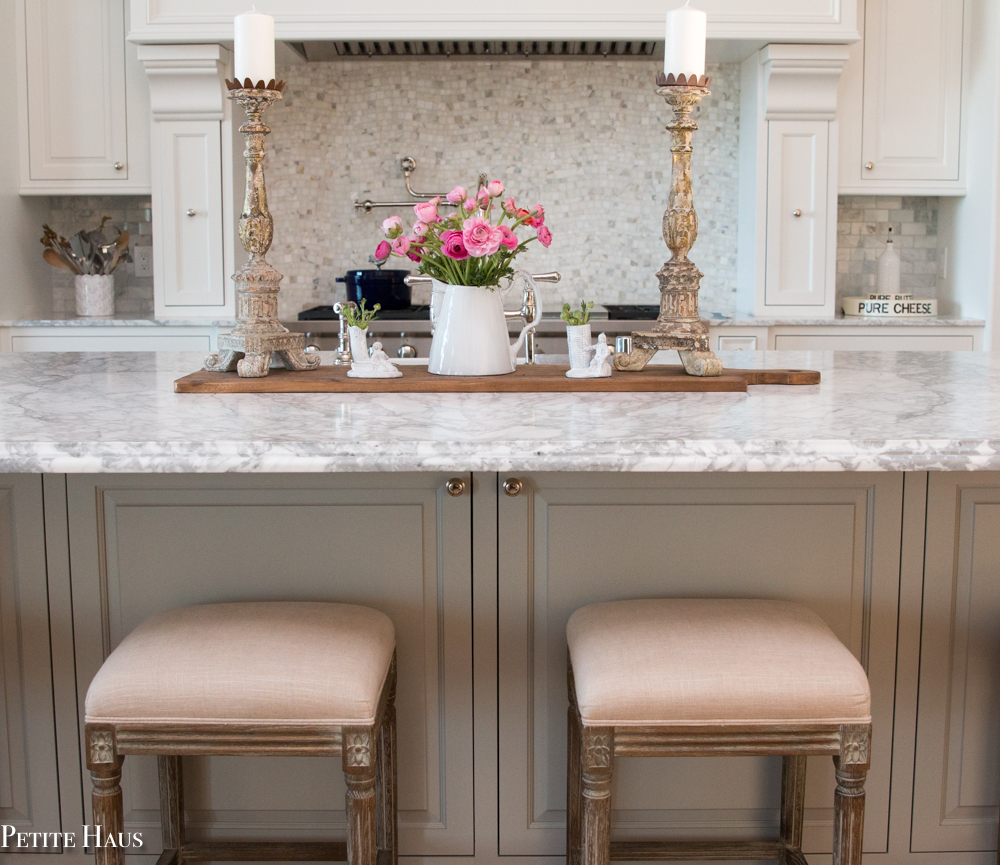
We absolutely love our double ovens and the French cooktop on our range. I also love our pot filler! I had not initially wanted a pot filler, however the night before the plumbing was finished in this wall I had a dream about using a pot filler. Now I am so glad we have it! 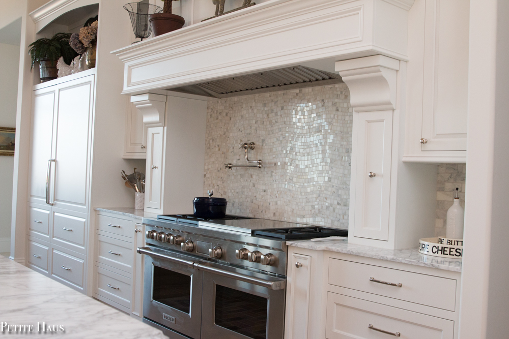
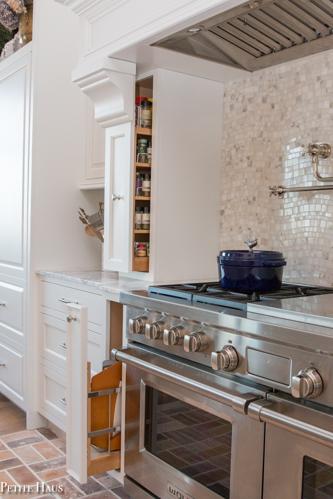
One of the cool things about our kitchen is that we have hidden spice racks next to the range! Next to the ovens we also have pull outs where we store baking sheets and our pizza peel.
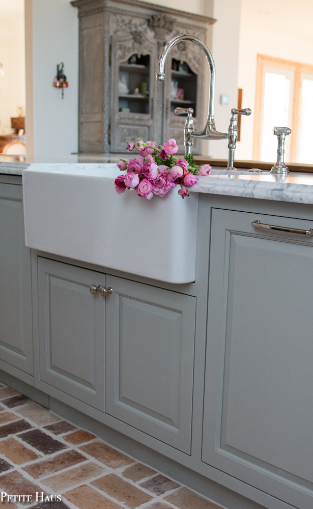
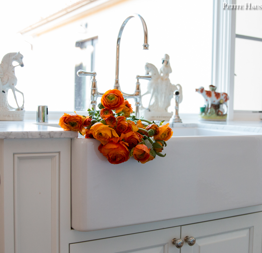
We *love* our apron sinks. I love how they hold our pots and pans. I also love how pretty they look with flowers! These are the Reinhard apron sinks. We liked them better than the Shaw apron sinks because the drain is in the middle and the profile is a little slimmer. Did I mention they are also a bit cheaper than the Shaw sinks?
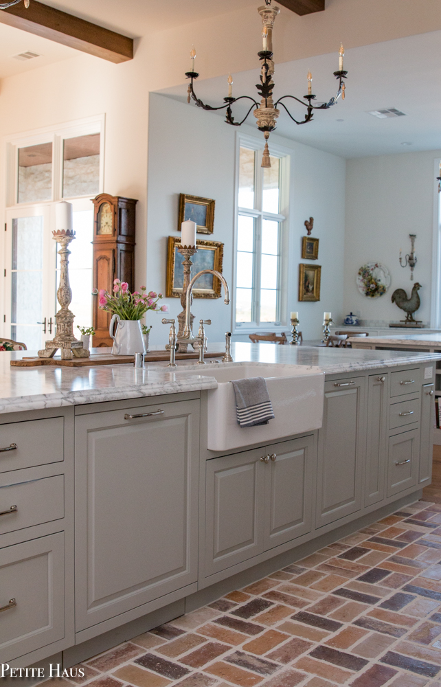
I always knew I wanted a bridge faucet. I loved the profile of this one. I love how easy it is to clean under the faucet. We went with polished nickel finishes in the kitchen as we felt it was the most timeless.
In this photo, you can see the main kitchen and baking kitchen – we dubbed it “his and hers”. My husband is the Chef de Cuisine (head chef) and I am the Pâtissier (pastry chef).
At the end of each island we have a little bookcase for our cookbooks.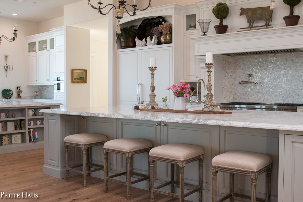
We can’t share sinks you see – so another sink is in the baking kitchen! Just kidding about not sharing – it’s nice having two sinks.
The marble counters are perfect for rolling out dough. I had known about all of the bad things about marble counters, but couldn’t care less! I am in love with them! I had mentioned in my designing a kitchen post that we chose Carrara marble. The Calacatta marble is a bit warmer in color, but as you can see we needed a lot of marble and that was way too costly. So we went with an extra white Carrara marble – same look, a fraction of the cost!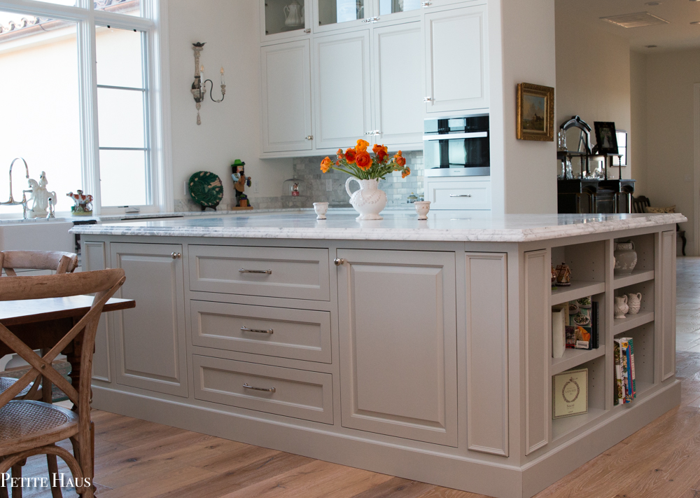
We have a little table on this side of the kitchen – the breakfast nook is what most would call it. But in reality it is the puzzle table! We had debated about doing open shelving next to the windows, but decided against it. I don’t like dusting, plus now I have more room to hang things such as this French Faience platter.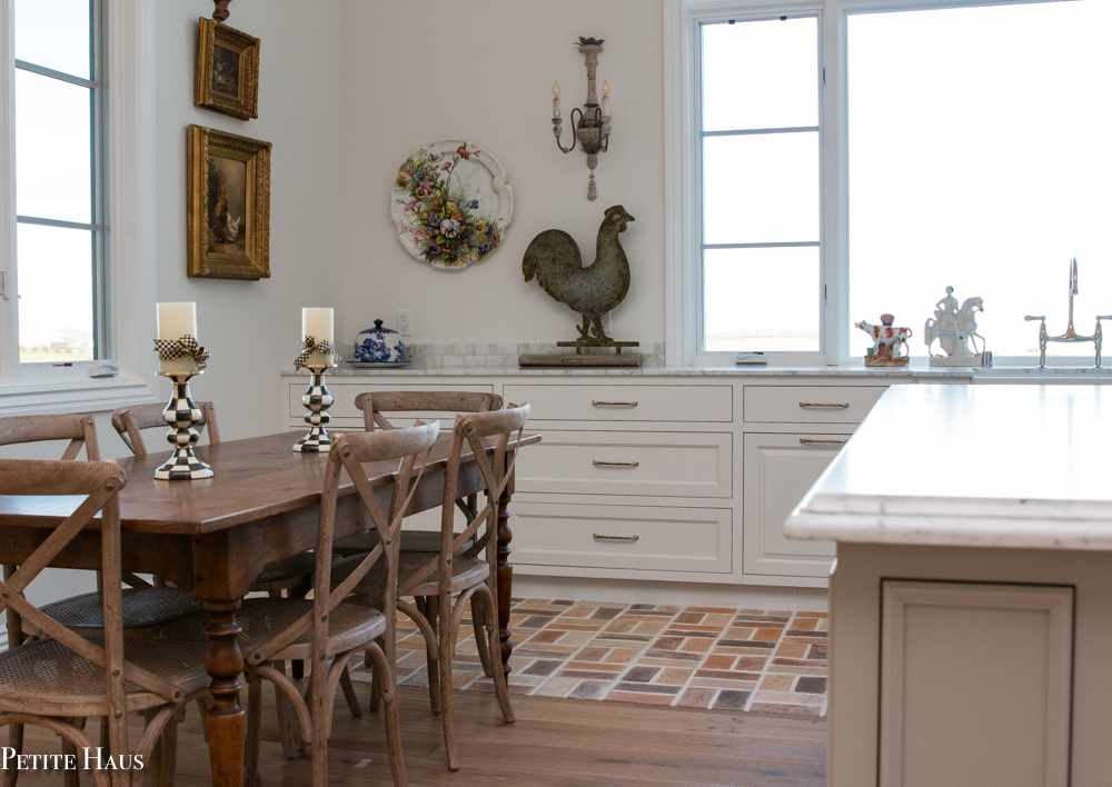
The white cabinets are Benjamin Moore Chantilly Lace. We had to choose a white that would not make the Carrara marble look too grey. Any whites with a cream undertone made the marble look bad. The trim in the room is the same as the white cabinets – if your cabinets are a white/cream color, the trim in the room needs to be the same color!
The chandeliers are from Restoration Hardware. I had debated about pendants vs chandeliers. There are so many beautiful lights to choose from, but ultimately I decided I liked the rustic and European vibe of these.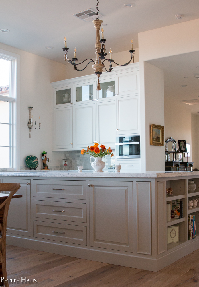
Again, brick is in the splash zone. That appliance is another oven. A steam oven for this baker! I still need to make my baguettes but there has been no time! Ample storage for baking – I receive many baking pans for gifts and now I finally have some places to store them! Yes, you counted correctly – 3 ovens. Why so many? Well it’s really nice when we host parties and cook for 30-40 people!
The cabinet hardware on the upper cabinets is different here – I went with an icebox latch. Since this is its own little corner in the kitchen, I decided I could do some different hardware here. What rules? 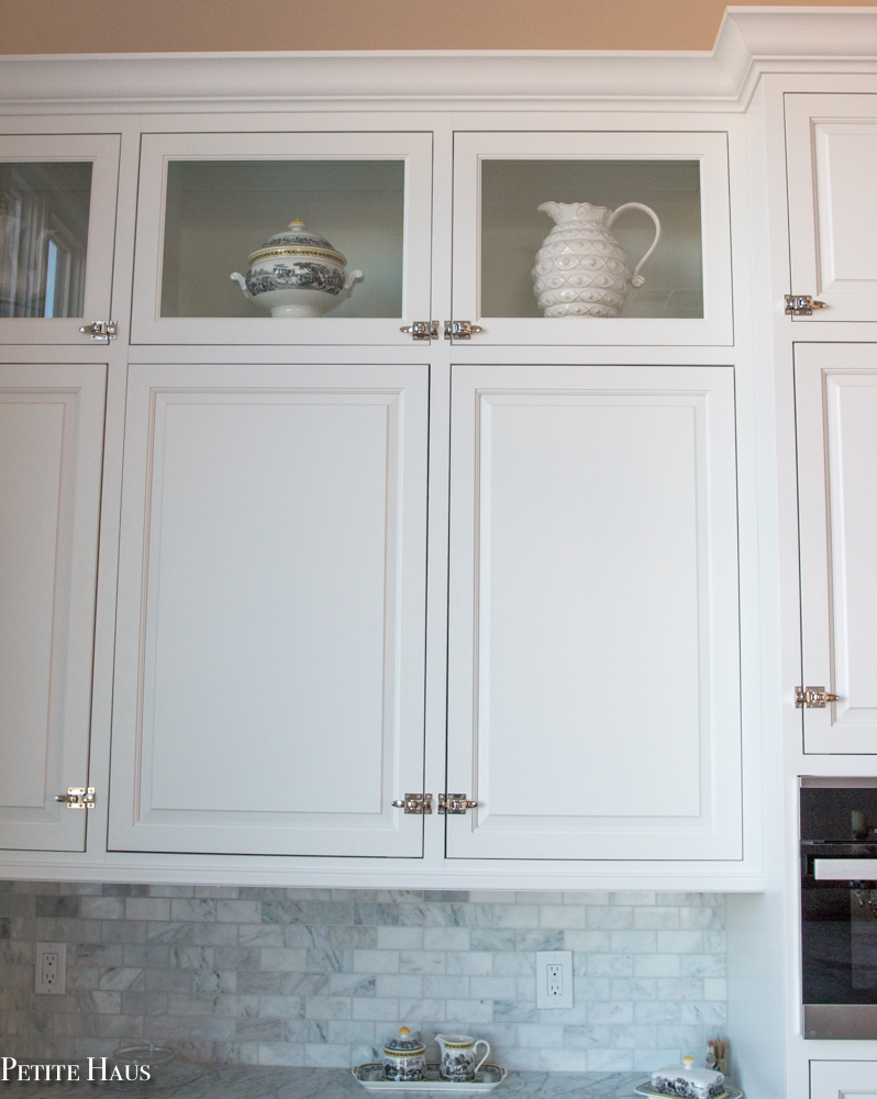
We went with large pulls for the drawers. We felt it was easiest to open a drawer if we had a big handle. Also, you can see where we hid a plug on the side. We had to have one by the sink for building code and stuck it here as opposed to in the counter.
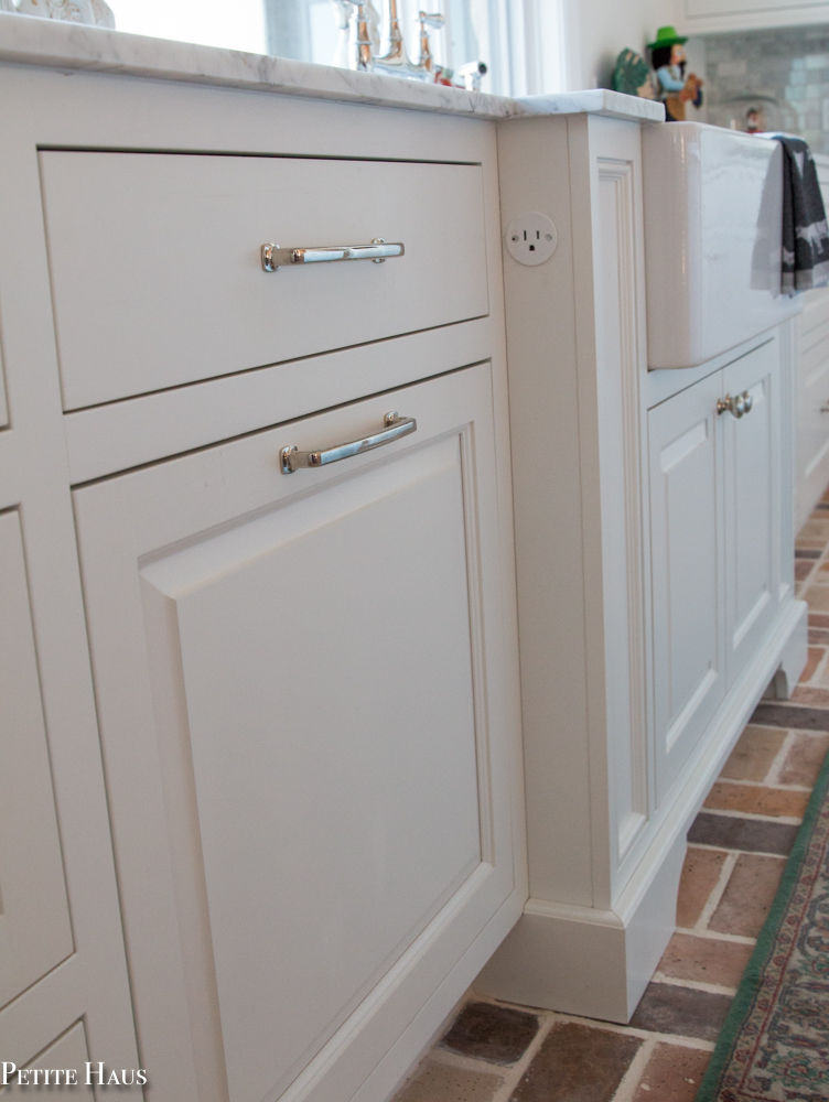
I just love this area of the kitchen. The kitchen sink is bumped out with little furniture feet. The sink looks out on the country with cows grazing – hence the little Staffordshire cows by the sink. Charles Faudree would be happy! Let me tell you also – it was not an easy task building the house so the window sits flush with the countertop! Another story for another day. 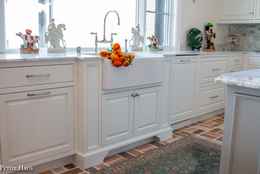
I hope you enjoyed the tour of our farmhouse kitchen. We love our kitchen and have been really happy with it. It is very big but we love hosting parties and it is certainly meant for entertaining! And guess what?! There’s more. I didn’t even show you the pantry. Update – Now you can check out the pantry, butler’s pantry and coffee bar here.
Here are all of my sources.
Sources (affiliate links)-
Hardware and Faucets:
Kitchen Bridge Faucets: Rohl Perrin and Rowe
Pot Filler: Rohl
Hardware pulls: Jeffrey Alexander
Hardware knobs: Jeffrey Alexander
Icebox latch hardware: Top Knobs
Finishes:
Kitchen cabinet paint and room trim paint: Benjamin Moore Chantilly Lace
Kitchen island cabinet paint: Benjamin Moore Silver Song
Kitchen wall and ceiling paint: Benjamin Moore White Dove
Sink: Reinhard Apron Farmhouse Sink
Countertops: Honed Carrara Marble
Backsplash: Marble Subway Tiles and Wavy Marble Mosaic
Brick Floor: Smooth Brick by Arto Brick in Creme Fraiche
Styling Accessories:
French counter bar stools: Cost Plus
French dining chairs – exact similar here and here
Chandelier – Restoration Hardware, discontinued (similar here)
Wall sconces – Restoration Hardware, discontinued (similar here)
Blue pot on stove – Staub, rooster knob
Towels – Williams Sonoma
Black and White Check Candlesticks – Mackenzie Childs















Absolutely gorgeous! I am in the process of buying a home and starting a new chapter for myself and my boys. It may not be my dream home but it will do for now ! The one thing that must be redone is the kitchen, currently it’s one wall , about 8.5 feet of cabinets and that’s with a sink and stove, the fridge is somewhere down the hall !!!!
The more I research the more I am loving the French casual style / I want something completely different from the dark cherry , granite I currently have!
In the end the kitchen I’m planning on redesigning is literally going to be 8.5 x 14 give or take …. I’ll definitely come back to your site for ideas ! Any ideas would be terrific !
Author
Laura, I’d suggest making Pinterest and Houzz boards. Just pin pictures you like. Then when you have quite a few, analyze which elements are present in all of the kitchens. That should give you some direction as to color schemes, cabinet types, hardware, etc!
Thank you ! I pin all my fave photos when the kids go to bed ! I am finding elements I like in individual photos and hoping to make my new kitchen unique.
Your kitchen is beautiful. My favorite is the marble counters! So lovely. Our next house will have marble too as I’m tired of granite. I love how you designed the area above the refrigerator. We bought a builder’s spec house and he left the area open and wired for a TV (who wants a TV in the kitchen?) and I decorate it, but need to finish it off like you’ve had yours done.
Author
I have seen some houses with a tv in the kitchen, so your builder is not the only one! Yes, finish it off so you can put some stuff over the fridge!!
Your kitchen is stunning! I just revealed our new kitchen on my blog. We love it. It is not nearly as grand as yours though!
Author
Thank you!
Your kitchen is perfection! I do love the color you chose for the island. We have the same carrara marble backsplash and I can imagine how perfect that color must be. Love the light fixtures, the brick floor, the sink, and all the decorative items you’ve chosen. It’s beautiful!
Author
Stacey, thank you very much! The classic Carrara backsplash is timeless and goes with many different things, doesn’t it?
Angelina, your kitchen is a dream! Everything looks absolutely gorgeous! You have thought of every detail and done such a wonderful job! Enjoy you new space!!!
Author
Shannon, thank you very much! We are enjoying cooking/baking in it!
Angelina,
What a fabulous kitchen! The huge islands are large enough for eating areas beyond the work spaces. I love the ogee edges of the marble countertops. And looking out a large window over the sink… perfection.
Judith
Author
Judith, thank you very much! Ah, you noticed my marble edges! Yes, we did two different types – ogee on the island and straight on the rest of the kitchen
This is a true dream kitchen! There are so many great things you selected and the space is fantastic. Love the brick flooring in the work areas- so smart! Wood is just not practical. That is one fantastic range you have and of course the window at the sink is wonderful. I like how the beams look- great job. You had a great vision with this and pulled it together very nicely!
Author
Liz, Thank you very much! It took a lot of work and we are thrilled with how it turned out!
Fabulous! This looks better than kitchens I’ve seen featured in magazines. Thanks for the resources!
Author
Aww, thank you! I agree with you – but I might be a little bit biased!
Beautifully done in ever aspect right down to the location of your outlets and would ‘knock the socks off’ many of the ones featured on Houzz. That said; would you mind sharing the name/model of the fridge you chose? Thank you! -Brenda-
Author
Thank you for your kind words! I don’t know the exact model # of the fridge, however the fridge is a Sub-Zero and is from their integrated line – there are a ton of different sizes you can choose from. We love our fridge. They are more expensive then other fridges, but honestly it keeps our produce fresher for way longer than any other fridge!
Thank you so much for your prompt reply. With much appreciation -Brenda-
This is farmhouse perfection!! I especially love the flowers in the sink!
Author
Thank you very much!
What a gorgeous kitchen! I love all the different textures and elements! And the polished nickel hardware is a stunner! Thanks for linking up with our Friday Friends Parade!
Author
Thank you so much!
Oh, goodness! Your kitchen is absolutely perfection! You have done a beautiful job! Thank you for sharing. You are one of the features at the Make it Pretty Monday party at The Dedicated House. Here is the link to this week’s bash: http://www.thededicatedhouse.com/make-pretty-monday-week-245/ Have a gorgeous week ahead! Toodles, Kathryn @TheDedicatedHouse
Author
Thank you for the feature!
Wow, wow, wow Angelina. You have the kitchen of my dreams. What a gorgeous and spacious kitchen!!! I love the light cabinets, sink, tile and that incredible island. Can I move in?? lol
Enjoy it for many years to come…
Janet
rosemary-thyme.blogspot.com
Author
Thank you so much! We love cooking and baking in it!
Your farmhouse kitchen is beautiful. These pictures are gorgeous. I just love all these details of your kitchen.
Author
Thank you very much!
Congratulations! Your post was my feature pick at #ThursdayFavoriteThings this week. Visit me at https://www.marilynstreats.com on thursday morning to see your feature! All hosts choose their own features from the comments left on their blog so be sure to return to my blog to see your feature. I invite you to leave more links to be shared and commented upon. Please don’t forget to add your link numbers or post title so we can be sure to visit!
Author
Thank you for hosting
This is beautiful. We just finished our coastal kitchen so I was interested in your details. We also did the full-size frig and full-size freezer. Don’t you love all that space? I like how you did the faux front panels though. Our hardware is also similar to yours. I think the wall behind the stove top is gorgeous too. You are way ahead of me when it comes to styling the kitchen. I haven’t done much of that yet but I will be taking some pointers here. 😀
Author
Totally love all of the space of the fridge and freeze. Thank you for your kind words!
Angelina! That turned out gorgeous! That brick is very pretty. Thanks for sharing at Home Sweet Home!
Author
Thank you so much!