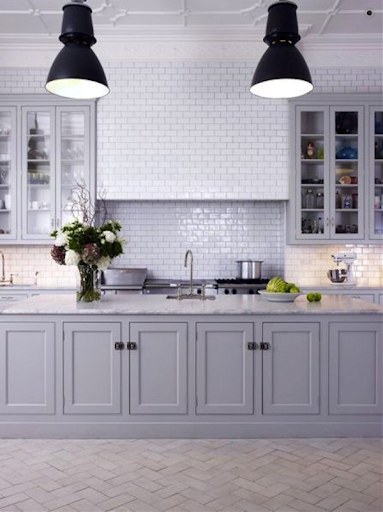
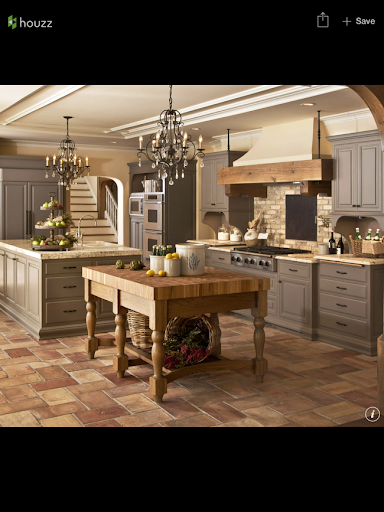
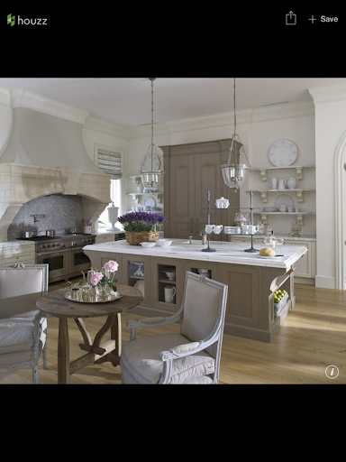
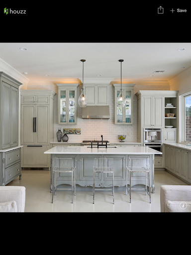
A Christopher Peacock Kitchen and Ice Box Hardware

We use affiliate links in our posts and our site. This means if you make a purchase using these links, we may earn a small commission. You don’t pay a cent more than you would otherwise! Our full disclosure is available under About.

Let’s talk about kitchens.

I have to make some choices regarding my entire kitchen soon.  I have actually saved these pictures for months but decided to turn to them again recently as the housing project moves along.

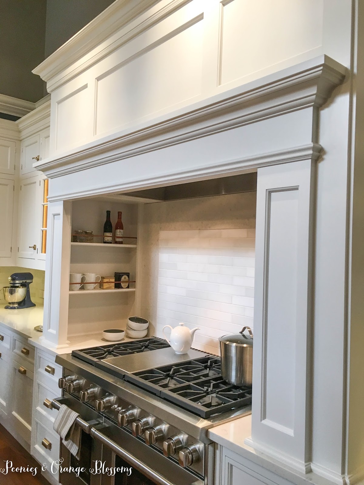
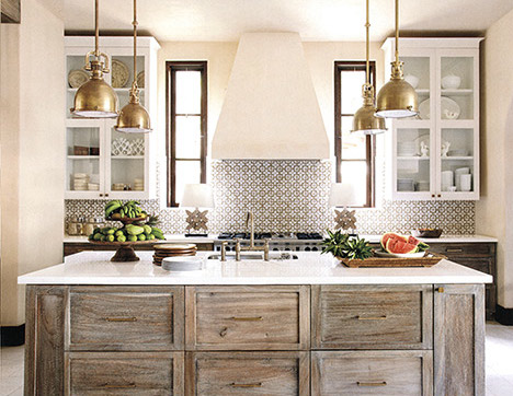
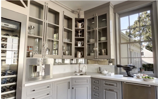
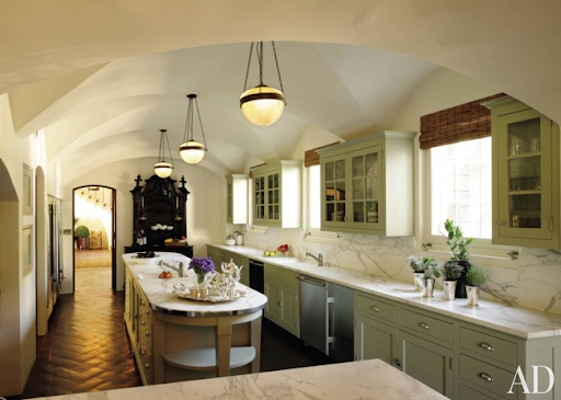
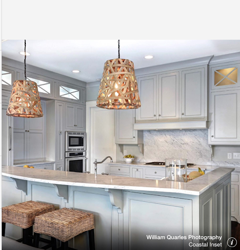
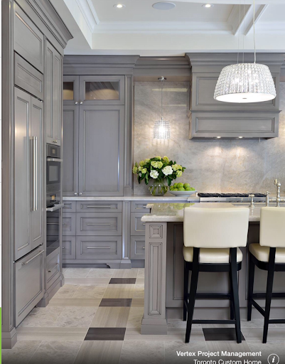
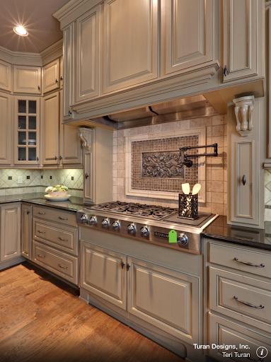
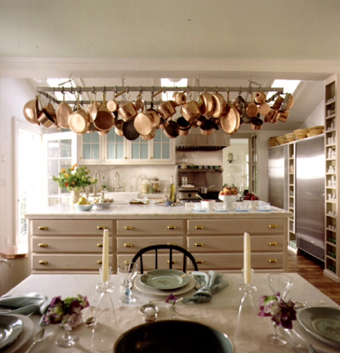
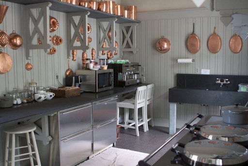
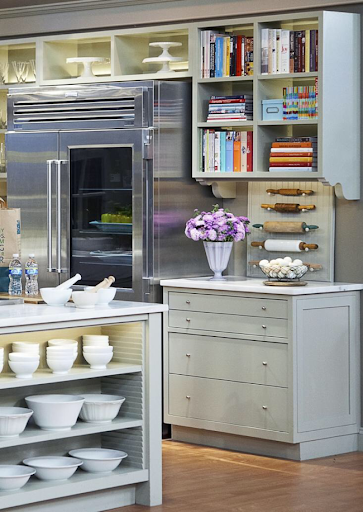
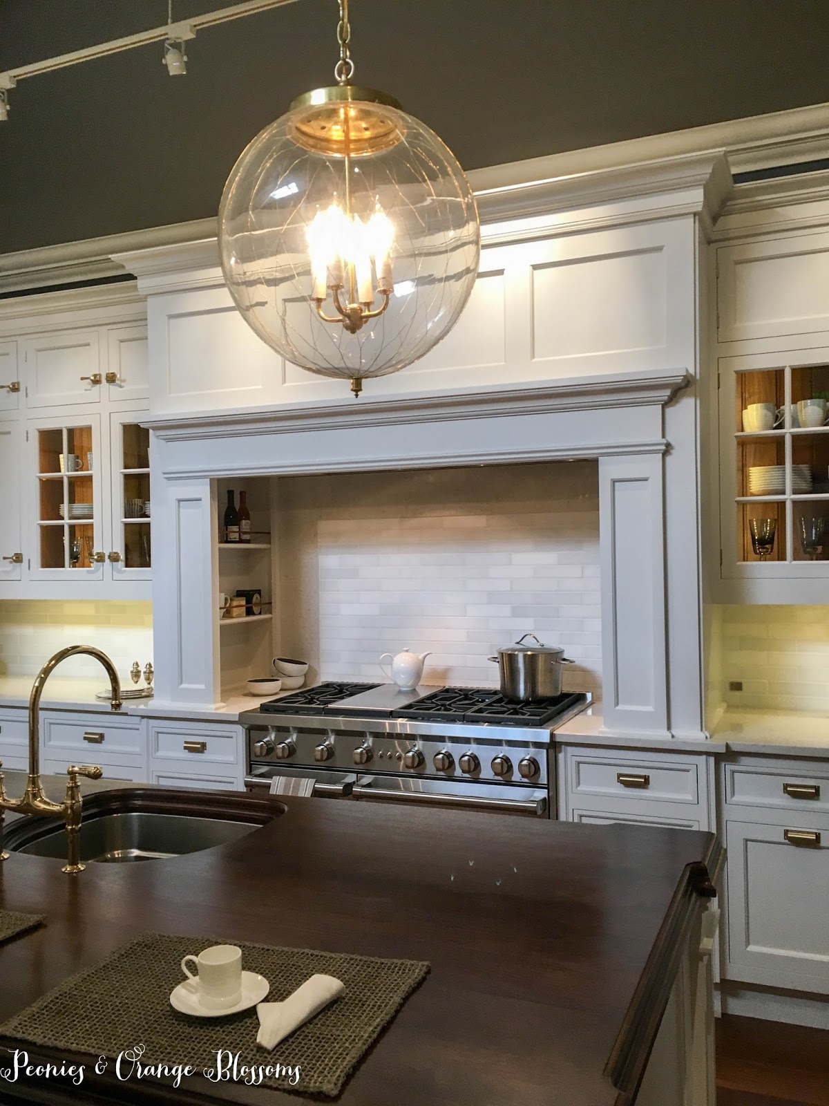
We went to the Christopher Peacock showroom and I fell in love with the scullery kitchen.

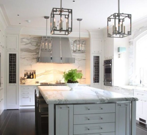
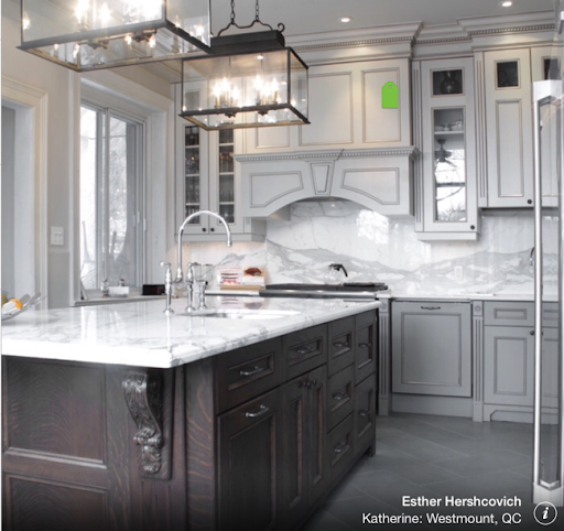
I really liked the kitchen hood.

This post may contain affiliate links. 

I like the little shelf on the hood where I can put stuff (I can imagine some Christmas greenery there…).  I like the panels on it. I also like how the spices are immediately next to the range, but are hidden if you look at it head on.

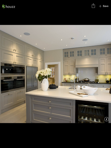
I snuck in quite a few pictures…

The big stone and metal hoods I don’t think are for me and will clash with my stone fireplace.

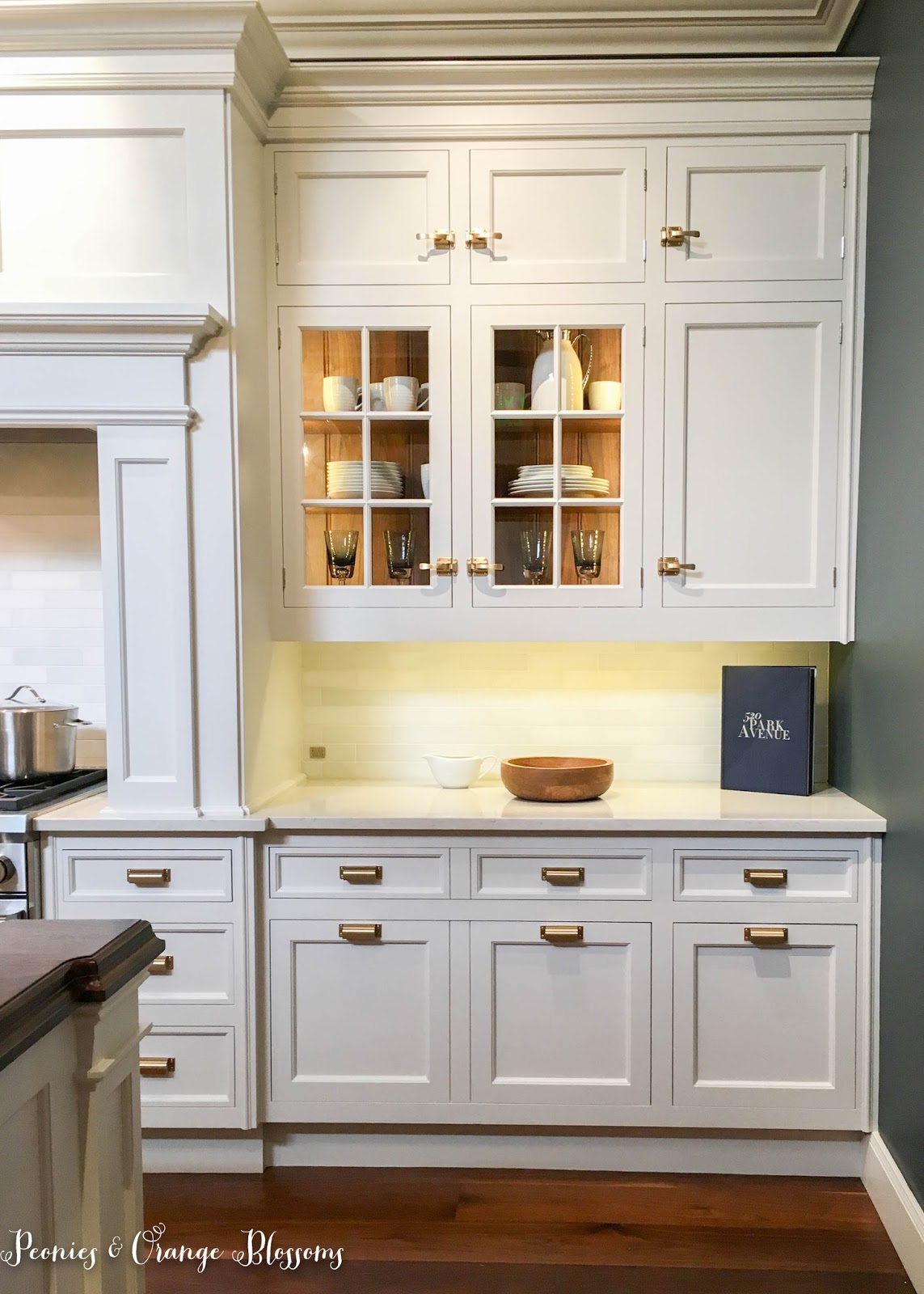
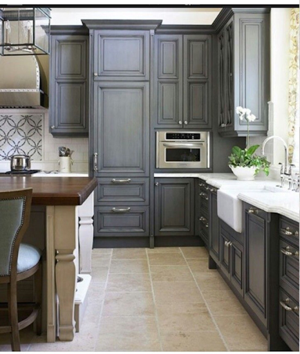
I like the ice box handles a lot – great in earthquake country!

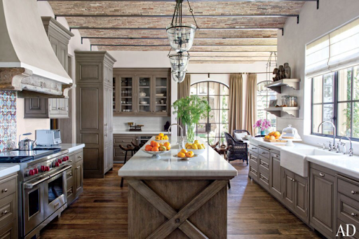
Also, I liked seeing the natural wood behind the glass doors.  This reminds me of my kitchen that my Opa built for my Mom back in the day – he had exposed wood behind the cabinet *just like* the picture below.

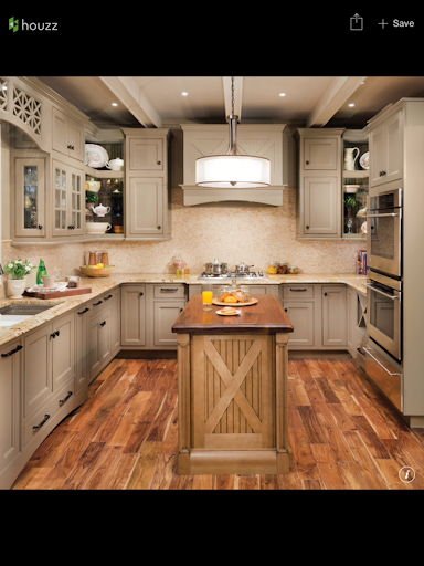
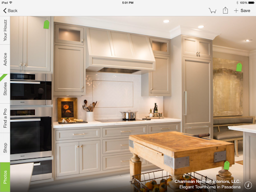
Now, I confess I do not think the wood island is practical at all and would not copy that for my kitchen.

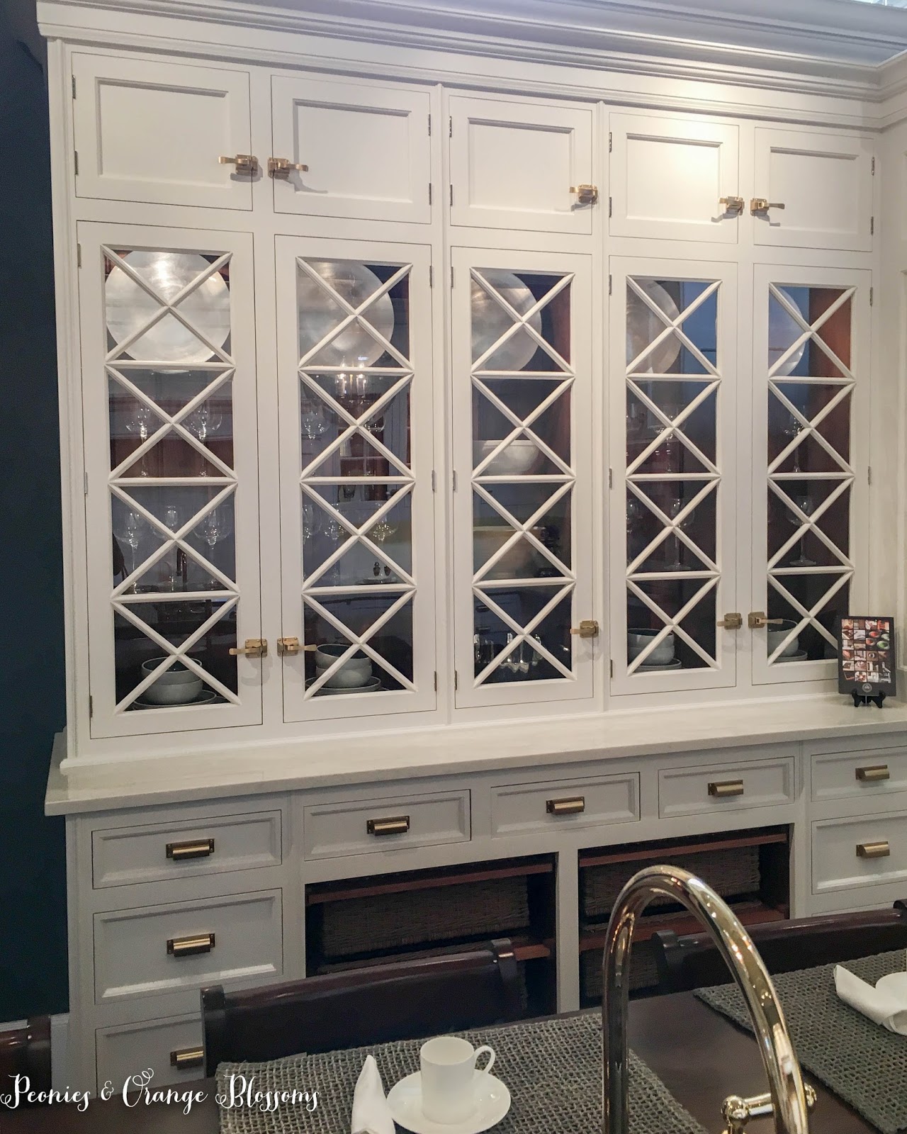
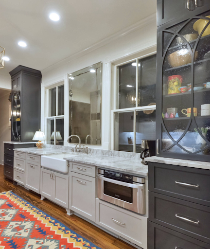
I love the X bars on these cabinets.


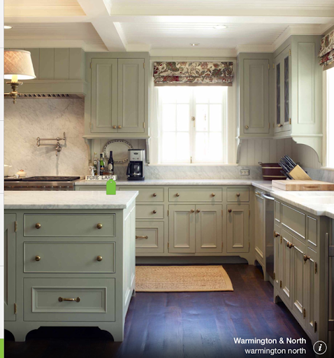
I have been in constant debate with myself about hardware and cabinet colors.  We will have wood floors so I have decided to paint the cabinets so they won’t clash.

I will likely paint them in some sort of cream color.

Now the question is – brass vs oil rubbed bronze vs polished nickel?!?

I love the warmth of the brass, but wonder, is it just a trend?

Oh, and I LOVE these linen baskets that are built in – aren’t they clever??

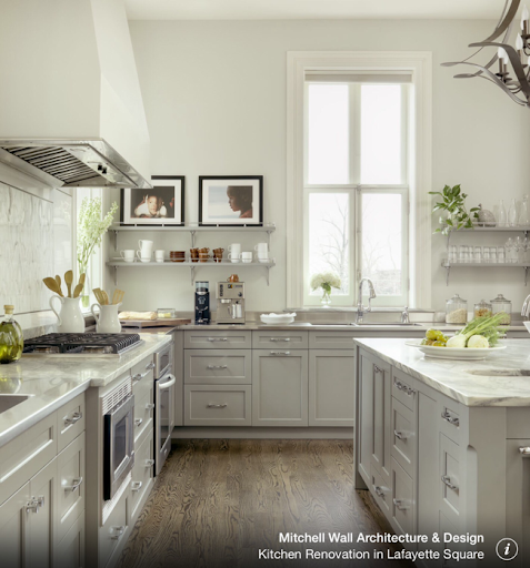
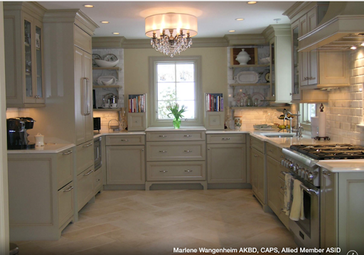
But, I have included a few other kitchens of his that have polished nickel.

Aren’t these chandeliers fun? Anyway, we’re looking at cabinet hardware, not chandeliers!


Hmm, still don’t know about which color to choose… but what I do know, is that I want icebox latches for the uppers!

Now, I found some copycat ice box hardware.  The first one is from Rejuvenation Hardware here.  The next one seems to be the most similar and is from Cliffside Industries.

Follow:

French Antiquing trip to Portland and Kitchen Faucets

We use affiliate links in our posts and our site. This means if you make a purchase using these links, we may earn a small commission. You don’t pay a cent more than you would otherwise! Our full disclosure is available under About.

Earlier in the month we went up to Portland to do some antiquing and shopping!  We went up to the Portland Antique Show at the Exposition Center.  There are tons of booths… and we walked 17,000 steps (thanks apple watch and fit bit for counting!)

This post may contain affiliate links. 

I thought I’d share some pics from the show and various antique stores around town! At the end of the post I am going to ask your opinion about some kitchen faucets for the French Farmhouse!


Considered this antique French piece to use as a vanity base for a sink *but* it was only 27″ tall. Much too short for a sink!


The pictures from the cases below are from a fabulous booth… she always has the coolest small things!


 I *may* have purchased these little lion statues. Ok I did purchase them. They are from France and probably from the 1940s, so not super old, but the shields they have on them display the Fleur de Lis!


I’ve been looking for an antique handmade quilt for my bed, but these did not quite fit the bill… maybe next time…


 Love this little French shop in town, she carries both new and old items…

 Well, I found a pair of sconces to go home with me… I think I will use these above the fireplace!

 Oh boy, I’m tired, time for a chocolate break… (Aren’t these little chocolate and marzipan treats so cute?)


What’s this? A place full of Madeleine pots? Antique fountains and fun?


 Hmmm, what color to choose to place around our little fountain? I envision a little French courtyard with what I’m calling the Orangerie but really it will have four pots around the fountain – one with lemon, one with lime, one with orange, and one with a satsuma tree!  I think this dark green would look best with these little trees in them, don’t you think?


But this color is cool too. Do you spy all of the vintage/antique garden follies?

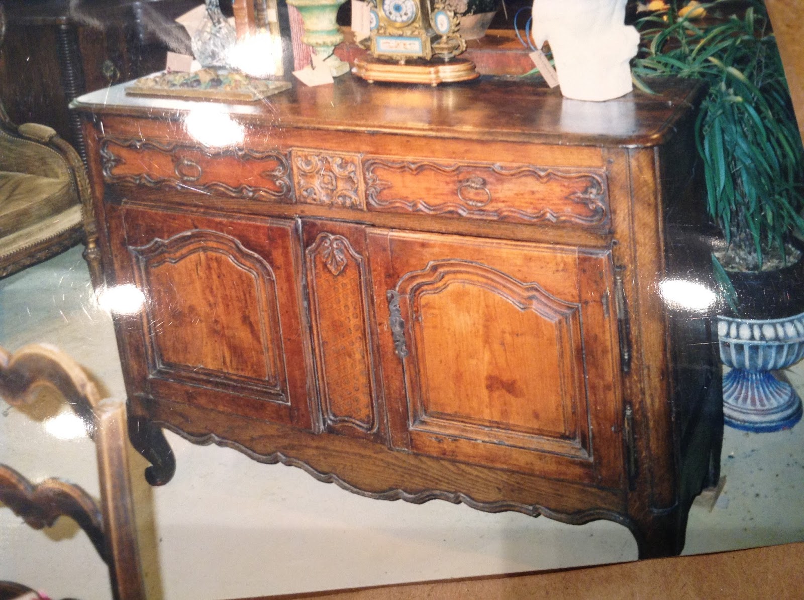
Oh, and I purchased this. Yes it’s a picture of a picture but it was in pieces in the shop.  I’m going to cut off the top (the horror!) and put a marble top with a sink in it! I know wood colored wood is totally out but I don’t care I love this French piece!

 We walked around the Portland International Rose Garden… one of my favorite places in the city.

 This bee was totally asleep in this pretty rose…

 A sailboat having a nice Summer day on the Columbia River…


Oooh, La La! Dessert? NO! This is breakfast!

 You see, *these* are the desserts…

I have also been searching for the kitchen sink faucet. Found these three I really liked. I obviously like bridge faucets. I think we will go with either polished nickel or polished chrome.  I think I am leaning towards polished nickel because it is a little warmer.  I thought I would go with the trendy brass color but then I haven’t seen one in person that I have liked, so I don’t know about that now.

Which one do you like better? #1 below…

Or #2?

Or perhaps #3??


SaveSave

Follow:

A Kitchen from the Movie, “The Intern”

We use affiliate links in our posts and our site. This means if you make a purchase using these links, we may earn a small commission. You don’t pay a cent more than you would otherwise! Our full disclosure is available under About.

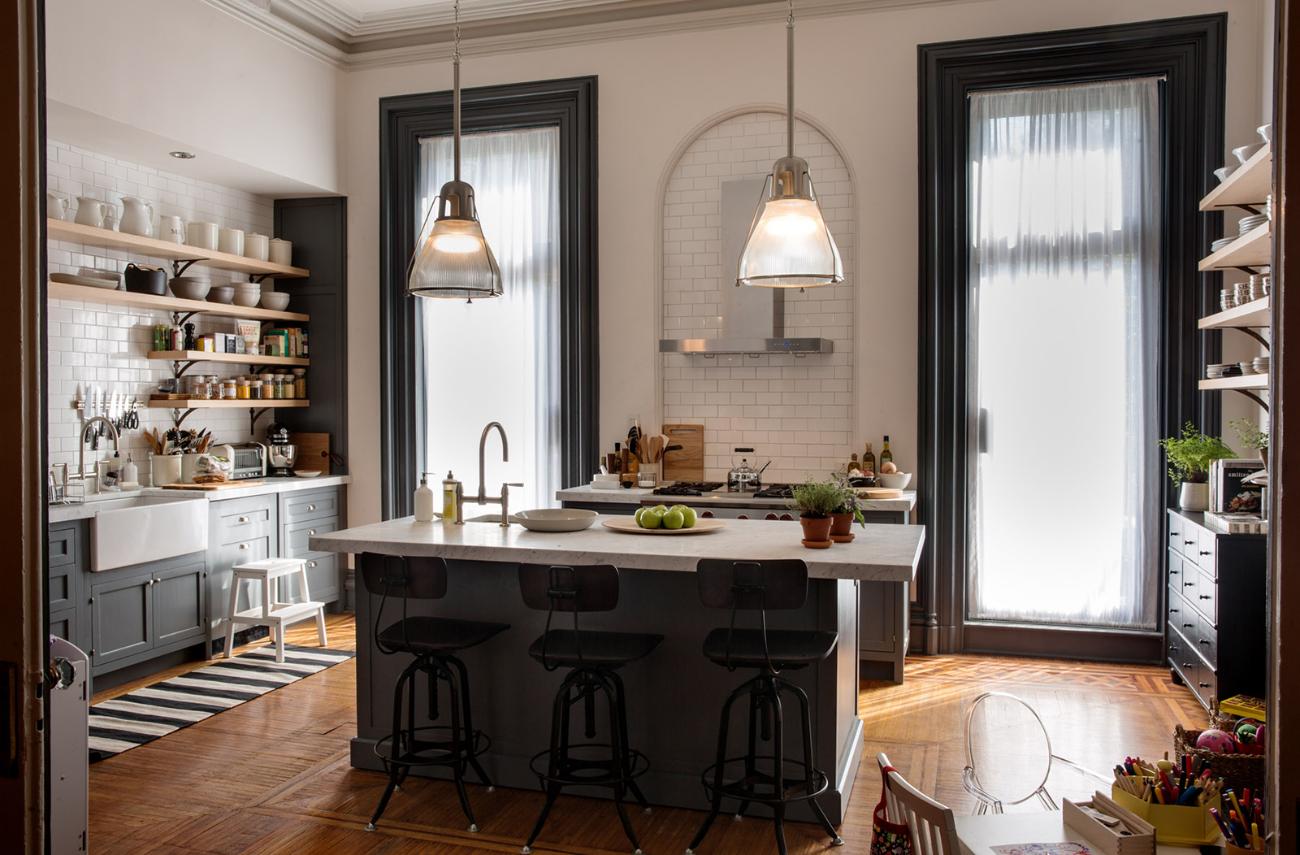
I recently watched a movie called “The Intern” starring Anne Hathaway and Robert DeNiro.  The movie is about the relationship between Ben (Robert DeNiro) who is a 70 year old who interns for Jules (Anne Hathaway), the founder of a successful e-commerce website.  The movie navigates through the age-gap.  I thought the movie itself was so-so, but what I really liked was Jules’ kitchen!

the kitchen on the movie set, the intern, from architectural digest

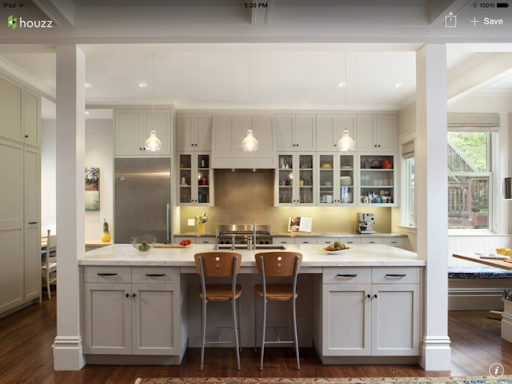
I thought this kitchen would appeal to many people… it’s very modern. The open shelving, the subway tile, the white and grey color palette!  Apparently the barstools are from Restoration Hardware.

 Then there is the pendant lighting over the island too. Oh, and white countertops… can’t tell if they are marble or quartz, or some other product.

Now the director and writer for this movie, Nancy Myers, has done many of my favorite movies… the new Parent Trap, the Holiday, It’s Complicated, Something’s Gotta Give… so of course the set on this movie was beautiful!

Pictures are Architectural Digest and are not mine.

What do you think of this kitchen? 

linking up at: amaze me monday The Scoop! Fabulous Party  Table It Party Metamorphosis Monday’s Inspire Me Tuesday Wow us linking up at: amaze me monday The Scoop!  Metamorphosis Monday’s Inspire Me Tuesday Wow us Wednesdays! Share Your Style Thursday Favorite ThingsThoughts of Home Home Sweet Home Feathered Nest Fridays Foodie Friday & Everything Else  Best of the Weekend Share it One More Time

Written at http://peoniesandorangeblossoms.blogspot.com

Follow:

Cerused French Oak Kitchens and Cabinets – Kitchen Trend 2016

We use affiliate links in our posts and our site. This means if you make a purchase using these links, we may earn a small commission. You don’t pay a cent more than you would otherwise! Our full disclosure is available under About.

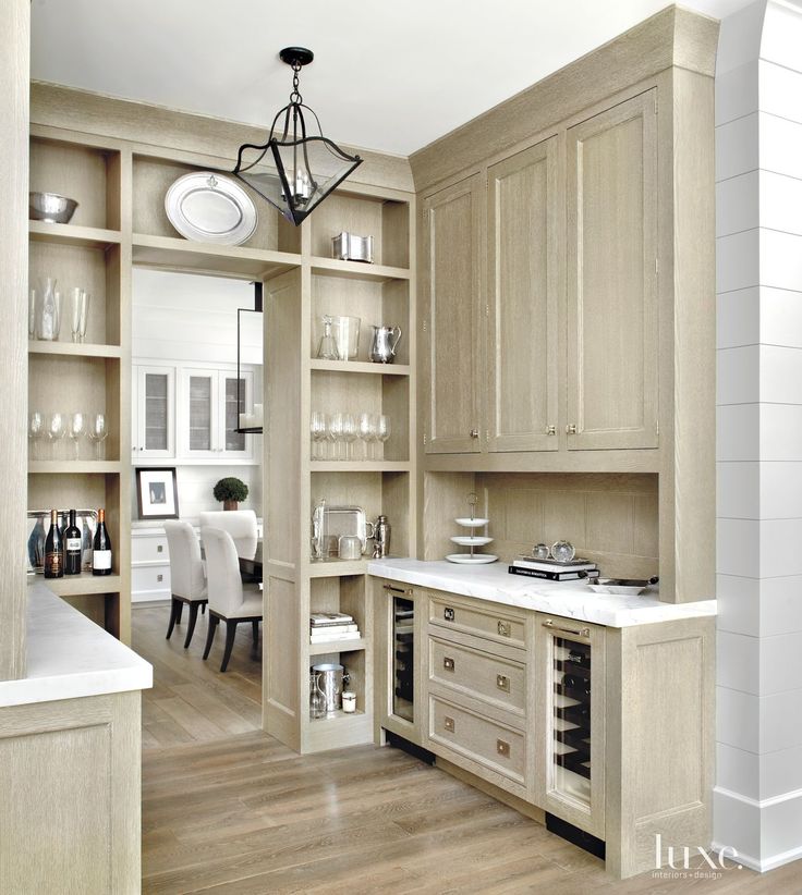
Every year I have written a post about kitchens. One year I wrote about all-white kitchens. Last year I wrote about Greige (grey/beige) kitchens, and this year I’m writing about my new love, cerused French oak kitchens!

cerused oak cabinet
1 – source

Cerused means that the oak floor/cabinet has lime or wax applied into the grain of the wood to give it a little depth and contrast. I totally love how soft it makes the cabinets look.

limed oak cabinet
2- source

What I like about this picture is that you can see the lime or wax in the grain of the cabinets.

3- source, house beautiful

This one below has a little less obvious limed oak, but is definitely the blonde French White Oak!
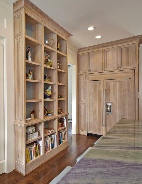
4- Traditional Kitchen by Dallas Kitchen & Bath Designers Backline Renovations
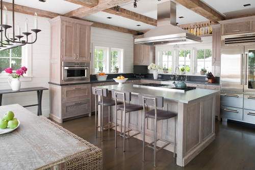
 

5- Beach Style Kitchen by Milford Interior Designers & Decorators Shelter Interiors llc
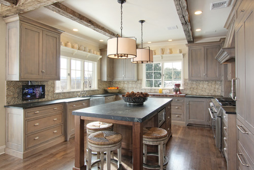
 

6- Rustic Kitchen by New Holland Cabinets & Cabinetry Quality Custom Cabinetry, Inc
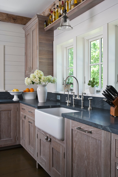
7-source

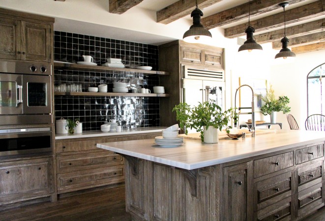
This kitchen below hits all of the right notes… open shelves, aged wooden beams, white marble countertops, cerused oak cabinets…
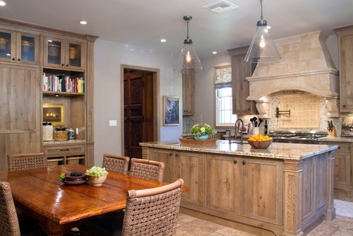
8- source

9-Rustic Kitchen by South Pasadena Interior Designers & Decorators Charmean Neithart Interiors, LLC.


According to this article, the cerused oak look came from the 1940s from the French designer Jean-Michel Frank. The trend has come out of high-end furniture sales at auction from the late 2000’s… This cabinet which sold at Christies for 40k is considered one of the main inspirational pieces for this trend…

source

I just wanted to show you that this is not a *new* trend… here is an 18th century Belgian cabinet with the cerused oak. Granted, it has probably had a new finish applied from it’s original. Isn’t it beautiful?

source

One reason the two furniture pieces above, while both cerused, look different is because of the cuts of the oak. The Jean-Michel cabinet is made from rift-sawn oak, whereas the 18th century Belgian cabinet is made from plain sawn oak.


Below you can see an image showing you how you can cut the oak and get different views of the grains.  Can you guess which one is the least and then most expensive? If you guessed plain sawn as the cheapest, you are right! The rift sawn is the most expensive and is currently considered the most desirable… naturally it’s the one I like best! I’m always picking out the most expensive everything even when I have no idea about the product!

Here are two more furniture examples, both from Restoration Hardware with the cerused oak. They called it “Aged oak” or “Grey Oak” but it’s the same thing.

This cabinet below is from the new RH Modern collection… Although I prefer the antique looking cabinet above!

Back to the kitchen tour, This is one of my favorite kitchens. Very stylish with the steel windows! Although, dark floors are going “out”, but I still think they look pretty!
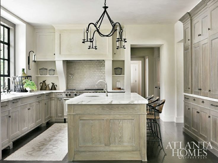
10 =photo: Atlanta homes & Life Styles

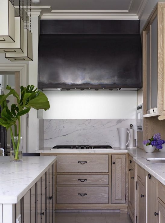
A more contemporary version, at first I thought the hood of the stove was a big screen tv!

12- source

Here is an example of a whitewashed white oak examples with grey undertones. It still has cerused wood. I like this look too.
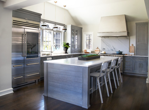
13- Transitional Kitchen by Mamaroneck Kitchen & Bath Designers Studio Dearborn


Here is a very contemporary cerused black oak kitchen. I actually don’t hate this black kitchen. Normally I hate black kitchens  and really modern kitchens but the limed look softens it a bit.
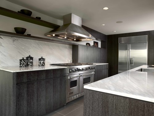
14 –Contemporary Kitchen by Seattle Cabinets & Cabinetry Warmington & North

A trendy kitchen complete with the now in-style brass fixtures! I still can’t believe brass is back in style… and the fact that I like it. I think it’s because the brass is aged and not shiny from the 80s.

15- source

This one also has some grey undertones. You can really notice that these cabinets are rift sawn.

16- source

Here the island is a cerused French white oak… The very tight grout lines of the tile below are also tres chic.

17- source

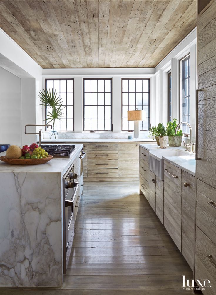
The kitchen below hits all of the trends. Let’s review them, shall we? Steel windows. French oak plank floors AND ceiling. Waterfall effect island of white marble. Farmhouse sink. Cerused oak cabinets. Did we miss anything? Oh, no over-the-counter shelves.

18- source

Now, I love this kitchen from Brooke Gianetti.  She used a custom French white oak cabinet with a custom stain. I can’t tell if its cerused or not – I think it is. Like the farmhouse sink, chandeliers over the island, wood beam ceiling, overmudded backsplash behind the stove, wide French oak plan floors, and dare I say, I even like the brass fixtures!

19= source: Patina Farm

Now, I think the cabinet below is more whitewashed than cerused, but it’s just another example.

20- source

This kitchen from Tom Brady and Gisele Bundchen does have greige cabinets on the sides, but the island is a cerused oak!

21- source

A more modern take on the look…

22- source

I like this kitchen below. Cerused cabinets in the way back with whitewashed cabinets in the front with travertine floors.

23- source

A contemporary cerused look. I like that the cerused cabinets make even harsh contemporary looks soften up a bit.

24- source

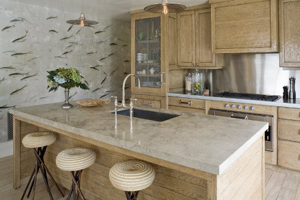
Here is a kitchen designed by Jeffrey Alan Marks, from the beloved Million Dollar Decorators (RIP) show. He used the white oak back in 2013, ahead of the times! That fish wallpaper is by DeGournay!

25- source

Are you liking this trend?

26- source

I have loved this kitchen for a long time. Windows on both sides of the stove bring in light. Two little chandeliers above the giant island. Greige/whitewashed cabinets in the back with cerused oak on the island. Overmudded limestone wall on the back. Aged wooden beams above. Travertine floors. I think I would want my kitchen to look like this.

27 – source

The kitchen below mixes two styles – cerused cabinets and greige island cabinets.
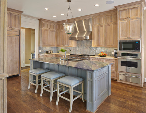
28 – Traditional Kitchen by Dallas Kitchen & Bath Designers Backline Renovations

Well, what do you think of this trend?? Is it a breathe of fresh air or does it remind you too much of your Grandma’s cabinets from the mid-century?

I want you all to tell me which one is your favorite in the comments – I put numbers below all of the pictures to make it easy for you! I’m really quite curious.  I think my favorite is #27.

Sources for the pictures are listed below it.

SaveSaveSaveSave
Follow:

Taupe and Greige and Grey Kitchens… Kitchen Trends 2015

We use affiliate links in our posts and our site. This means if you make a purchase using these links, we may earn a small commission. You don’t pay a cent more than you would otherwise! Our full disclosure is available under About.

I have been dreaming about kitchens again. Last time I was dreaming about white kitchens but then my mom recently remodeled her kitchen all-white and told me something I didn’t know… It was really hard to match the white of the cabinets to everything else. Apparently white paint is not created equal. Let’s think of the different whites: bright white, off white, egg shell white, creamy white, extra white, pure white, super white, antique white, dune white, warm white, cool white, etc etc ( I feel like Bubba Gump and his shrimp right now).

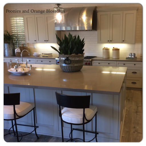
So, this past weekend we were touring model homes for fun and ran into this kitchen. The cabinets were painted a very light taupe color, which looks a little grey blue in the shadow. So then I started dreaming of a taupe kitchen. Or beige. Or grey. Or Greige I think is now the trendy term.

I have seen Greige kitchens online for a while now but never in person. I like the warmth that it adds. Sometimes white can seem a little institutional.

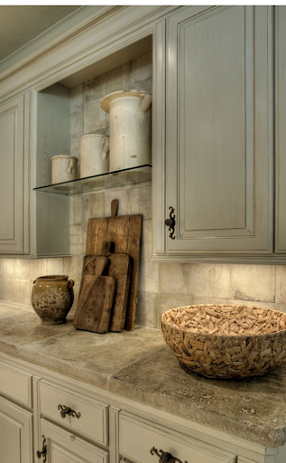
The kitchen above used antique French limestone for the counters.
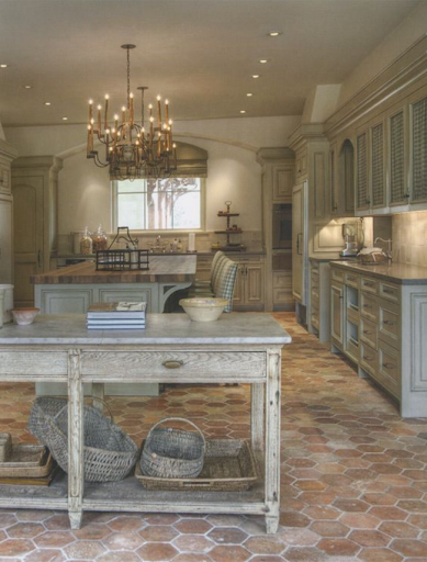
I just absolutely love everything about the kitchen below. It’s French. It’s grey. It has antique tile floors. Love it all!

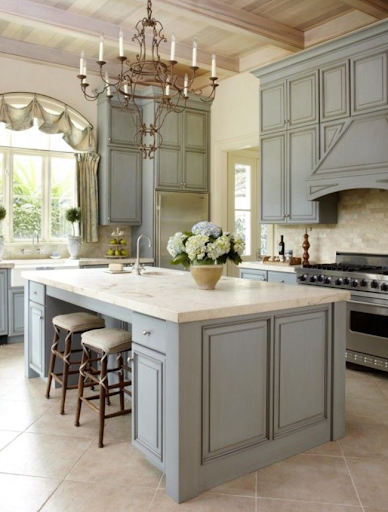
This grey leans towards Grey-blue but I think it’s still quite nice.

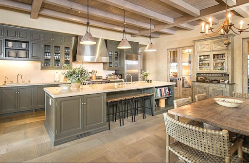
This one is a little darker grey below. I also like the light natural wood cabinets on the right.

The taupe below is nice. The white marble looks nice too.
The kitchen below is Gwenyth Paltrows kitchen. How fun is her door hardware?!

This kitchen below leans towards cream colored. Looks quite nice but I think it makes the counters look a little too grey.

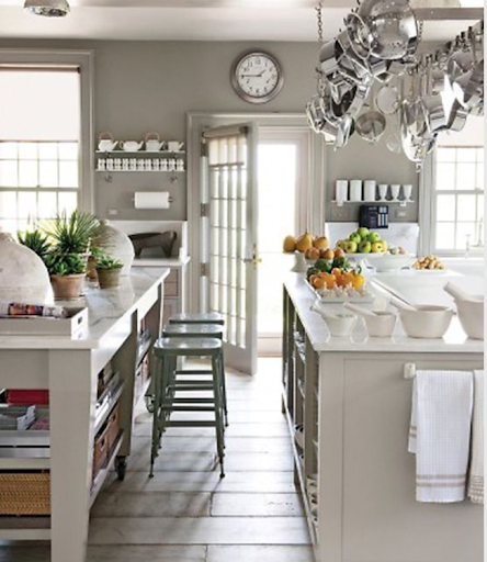
The Greige here leans towards the green end. It reminds me of Martha Stewart’s kitchen.

The oainted grey cabinets, natural wood island, wolf range and farmhouse sink below are to die for. Plus, notice the trendy steel windows. This is Tom Brady’s house.

Greige island with ghe rest of the kitchen white. See how the island looks a little warmer?

Neat cabinet color here, not a fan of the subway tile everywhere below.

Leaning towards a darker grey here….

Taupe colored cabinets with darker brown colored. Very trendy with the open shelves too. I am too messy for open shelves!

Like the cabinet colors of this kitchen.

The kitchen below leans towards the blue side of things…

Which do you prefer? The dark island or the Greige painted cabinets? I quite like the frenchiness feel if these cabinets. Reminds me of the St James collection from Restoration.

The cabinet colors below are nice but I don’t feel like they go well with the floor nor the carpet.

I like the cabinet color, lig floors.m

Notice how there’s no cabinet immediately next to the range hood?

The darker color here is interesting…

Nice cabinet color, but I feel like there are too many competing brown colors here…

I don’t care for the granite choice with the cabinets below…

Don’t you think the grey soapstone or white granite looks better with the taupe cabinets?


This one below has many trendy things… Greige cabinets, brass hardware, marble countertops…

The Greige below feels warm…

While this Greige below feels cool. It doesn’t always feel warm. I think the dark backsplash and countertops make this one below seem cool.


Notice several things with the kitchen below… Furniture-like cabinets, open shelves, the backsplash goes all the way up the wall, light floors, and Greige cabinets. All it needs is a farmhouse sink and it 100% on trend.

It occurred to me while I was researching grey kitchens that all kitchen trends this year are all imitating this one kitchen below! Martha Stewart’s kitchen from Turkey Hill! Painted Greige/green, farmhouse sink, marble counter tops, open shelving, and brass pulls on the cupboard! Who knew her kitchen from the 90s could still look so, well, in style?!

Let’s take a look at Martha’s other kitchens, since she really started this whole trend. The next two are from her Bedford home, painted in “Bedford grey”.


The kitchen below is the kitchen in her barn in Bedford…

And the one below is from her show’s set.

What do you think of the greige/grey/beige/taupe cabinet trend? Would you remodel your kitchen like that, or would you go for white? Or would you do something else all together? Had it occurred to you we were all copying Martha? Share your thoughts below!!


SaveSave

Follow:

Wonderful White Kitchens

We use affiliate links in our posts and our site. This means if you make a purchase using these links, we may earn a small commission. You don’t pay a cent more than you would otherwise! Our full disclosure is available under About.

I’ve been dreaming of my ultimate kitchen.  Some day within the next 5 years, I will be building my dream kitchen!

For a dream kitchen, you have to start thinking early!

One of my favorite looks: white cabinets with a light counter top.  Sounds easy to pick out, right? I couldn’t have been more wrong.
So many questions…
what color of white? (husband says… there’s more than one color of white?)
do you want cabinets with this door or that?
do you like these door handles or those?
do you want the island to match?
do you want the appliances to be white?
What type of sink do you want?
and the list goes on…

Here is a collection of white kitchens that I like. Ready?  Better sit down, there are lots of pictures!

Now, below, I like these cabinets, the hardware, the marble top.  And of course, who doesn’t love a la cornue stove? It’s a dream, right?!

La Cornue dream White kitchen

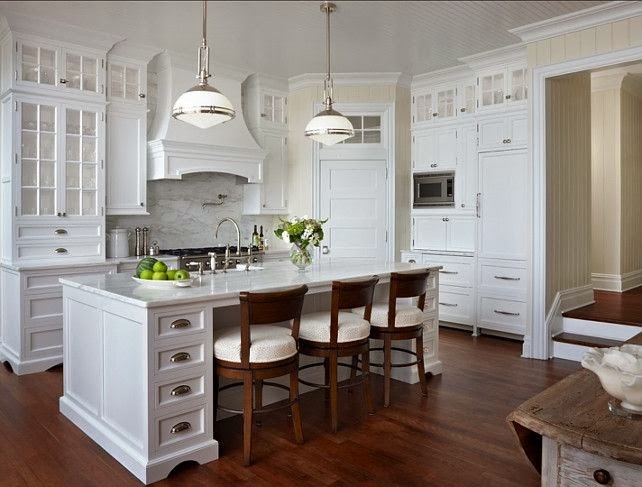
This one the fridge matches the cabinets.  I also like the hood over the range as it has a mantel that I could decorate!  Like the countertops!

dream white kitchen

I like in this kitchen below is the fact that the bar is low enough to sit normal chairs. I also like the area over the range, but I think some space is lost for storage.

country white kitchen

I like that the bar has a little sitting area that is table height.

white kitchen with a lower island in the middle for seating

Love this whole corner in this white kitchen. The chandelier is pretty too!

corner bar
love this corner bar in a white kitchen from decor pad

I like the backsplash in this kitchen below, the island. The chandelier is nice, but maybe a little too foofy for me.  The see through glass doors look pretty, but I think I would want frosted glass so I can hide my junk!

dream white kitchen

This kitchen looks really French. I love it.

French white kitchen

Below is one of my favorite kitchens. I love the area above the range. The only thing is I would change the island around and put the chairs on the long end instead of the short.  I also like the dark floors with it.

Love this white kitchen with the island from http://antiquestyle.blogspot.com

These cabinets aren’t super clean white, they are more of an aged white.  Now I’m getting confused on what white I like!

Ok, this kitchen checks all of the boxes. mantle thing above the range, light colored hardware, white cabinets with white countertops.

 I like the shades on this lamp below, makes the kitchen seem very soft!

classic white kitchen

Earlier I though the chandeliers were too much, but I like these little ones!  Don’t care for the back splash though.  The floor is also weird in the one below.

pretty white kitchen

I like how the edge of the marble is on the island in this one.  The light green color is interesting to make as a color for the island.

pretty white kitchen

Isn’t this one below pretty?

pretty French white kitchen

I like the tile floor in this kitchen below,

French White kitchen

Wood on the island below is interesting. You could use the whole thing as a cutting board if you’d like!

classic white kitchen with wood counter

Again, I like the tile floors as below…

White kitchen

 I’m running out of things to say about pretty kitchens…

white kitchen with Viking Range

The range below has white doors and knobs… interesting. Don’t know how I feel about it.

Country White kitchen

 Don’t like the range hood, but other than that… mostly white appliances. Silver or white? That’s the question!

white kitchen with white appliances

I think this green granite looks quite pretty with the white.

white kitchen with green granite

Then I found the kitchen below.  Hmm… maybe I like colored cabinets… uh oh.

Tom Brady’s kitchen from AD. 

To see more white kitchens,

Follow my white kitchens board on pinterest!
Also, Follow my French kitchen’s Board on pinterest!

Picture sources: pinterest, houzz.

I’ve linked up with:
The Scoop! at Confessions of a Plate Addict/Stone Gable, Metamorphosis Monday’s at Between Naps on the Porch, Inspire Me Tuesday at a Stroll Thru Life, Do Tell Tuesday at a Vintage Zest,  You’re Going to Love it Tuesday at Kathe with an E, Cottage Style Party at Lavender Garden Cottage  Wow us Wednesdays! at Savvy Southern Style, What’s it Wednesdays at Ivy & Elephants, Centerpiece Wednesdays at The Style Sisters Tablescape Thursday at Between Naps on the Porch, Oh the places I have been at the Tablescaper, Treasure Hunt Thursday at From My Front Porch To Yours, Feathered Nest Fridays at French Country Cottage, Seasonal Sundays at the Tablescaper, Sunday Best Showcase at Twigg Studios. Be sure to check out all of these fabulous blogging parties! A big thank you to all of the wonderful hosts!

Written by Orange Blossom at http://peoniesandorangeblossoms.blogspot.com

Follow:

From the Shop

I may earn a small commission if you purchase with these links

Caning Natural Tote Handbag - Universal Thread™
The Hustler High Waist Fray Hem Ankle Bootcut Jeans
Le Panier Pliage Raffia Crossbody Bag
Extra Large Le Pliage Panier Tresse Straw Tote
The Bennet Buttondown Shirt by Maeve
T Monogram Perforated Leather Bucket Bag
Mellow Stud Mule
Le Pliage Marinière Recycled Nylon Canvas Travel Bag
Unseen Sunscreen Broad Spectrum SPF 40 PA+++
Maxine Stripe Cotton Button-Up Shirt
Citizens of Humanity Charlotte High Rise Straight Jeans
Navy Equestrian Traversee M Linen Tote
Cream Carrie Blouse
Ellison Natural
Jolene High Rise Vintage Slim
Citizens of Humanity Blue Jolene Jeans
Charlotte High Rise Straight Jeans
Women's Le Pliage Filet Top Handle Bag - Ecru
Vintage cotton crewneck T-shirt
Air Heart Sunglasses
Le Pliage Torchon XS Top Handle Bag With Strap
Santorini Raffia Basket Bag
Chuck Taylor® All Star® Lift High Top Platform Sneaker
Please note that I use ShopSense, LIKETOKNOW.it, Shareasale and Amazon affiliate links on this site. This means using them for purchases won’t cost you extra but may earn me a small commission.  Our full disclosure is available for viewing under About in the disclosure policy.
All rights reserved. Our graphics, images and text are all subject to copyright protection.